I wear autumnal shades year round, and I wear the hell out of them when autumn finally comes around again.
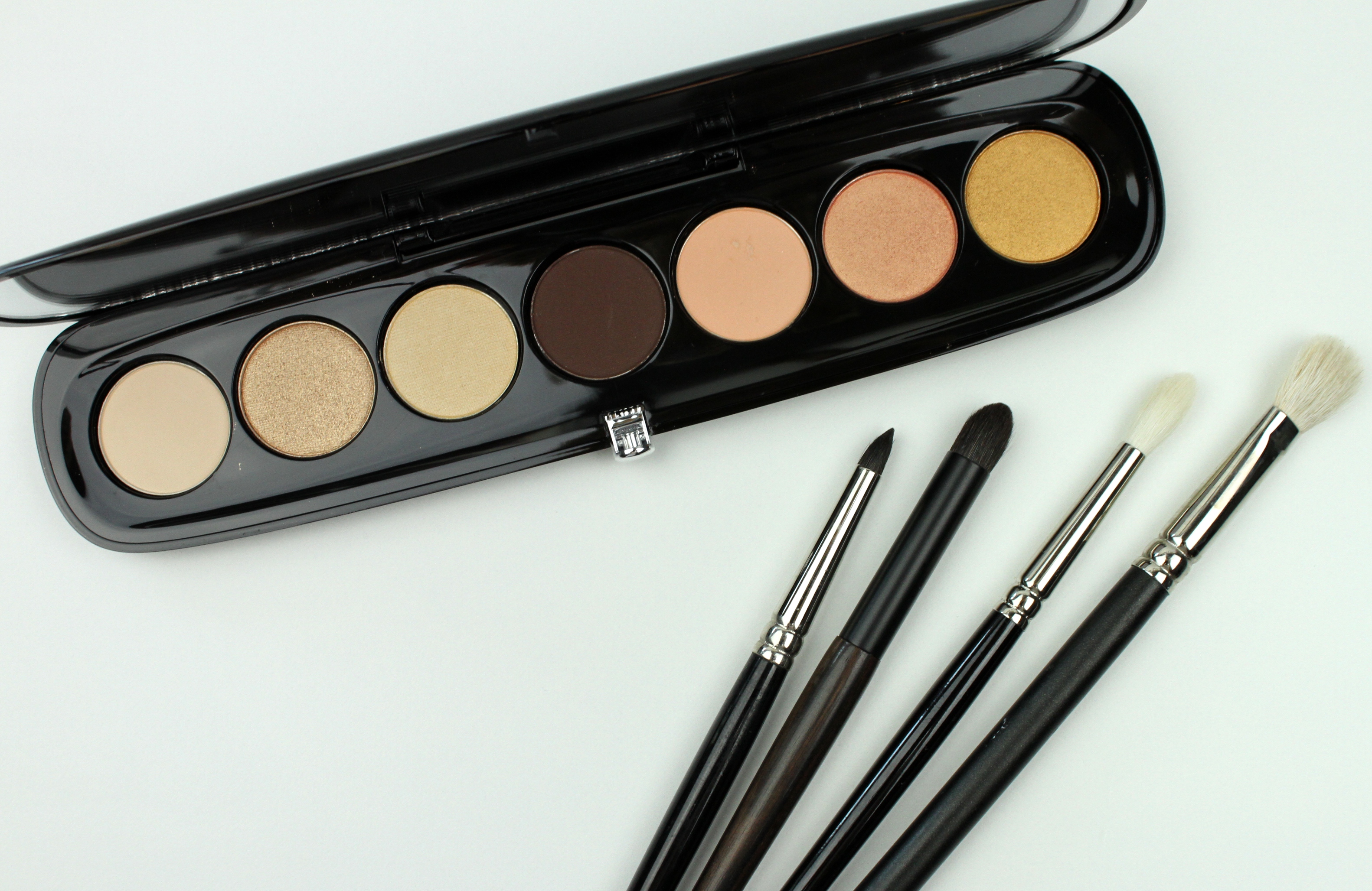
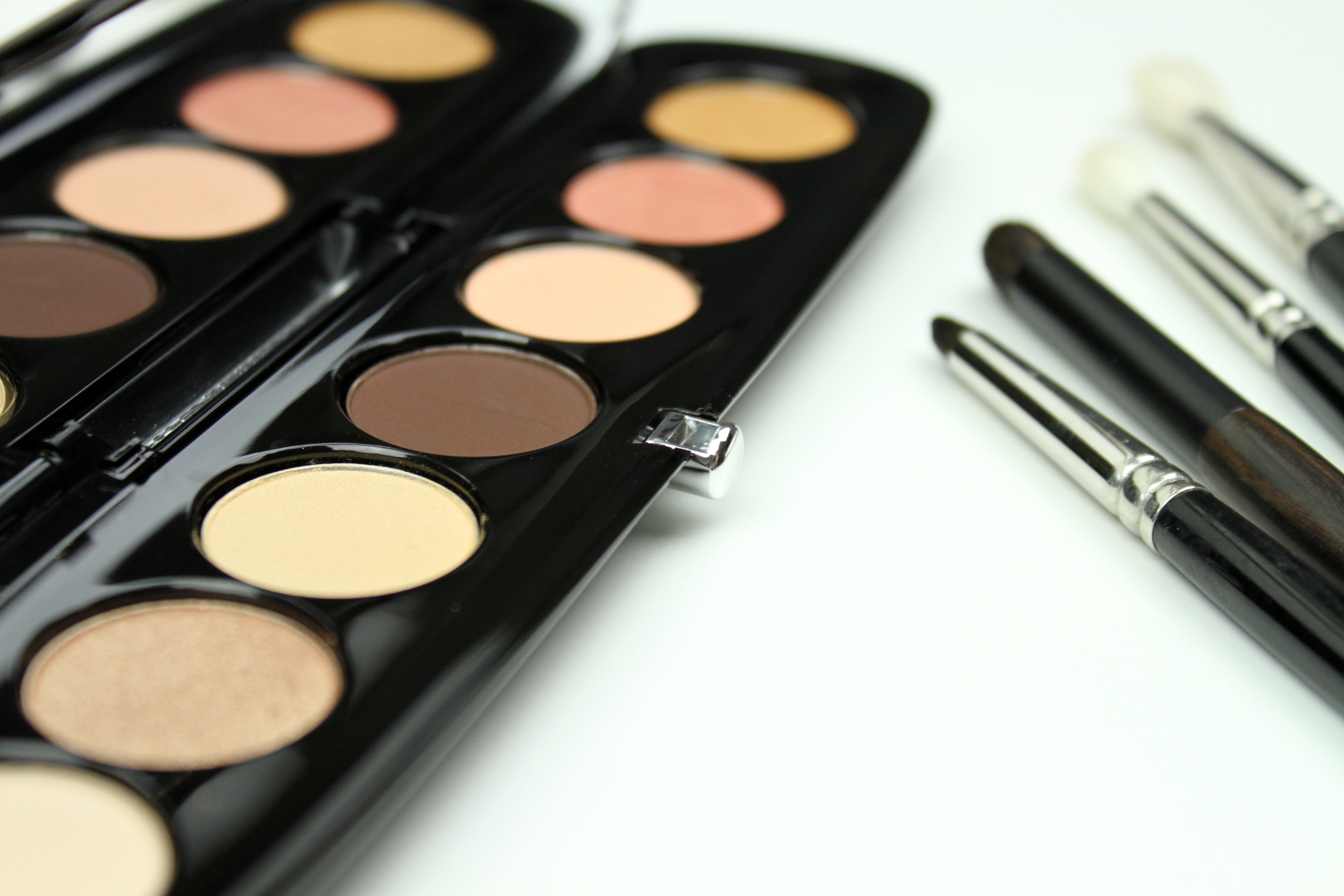
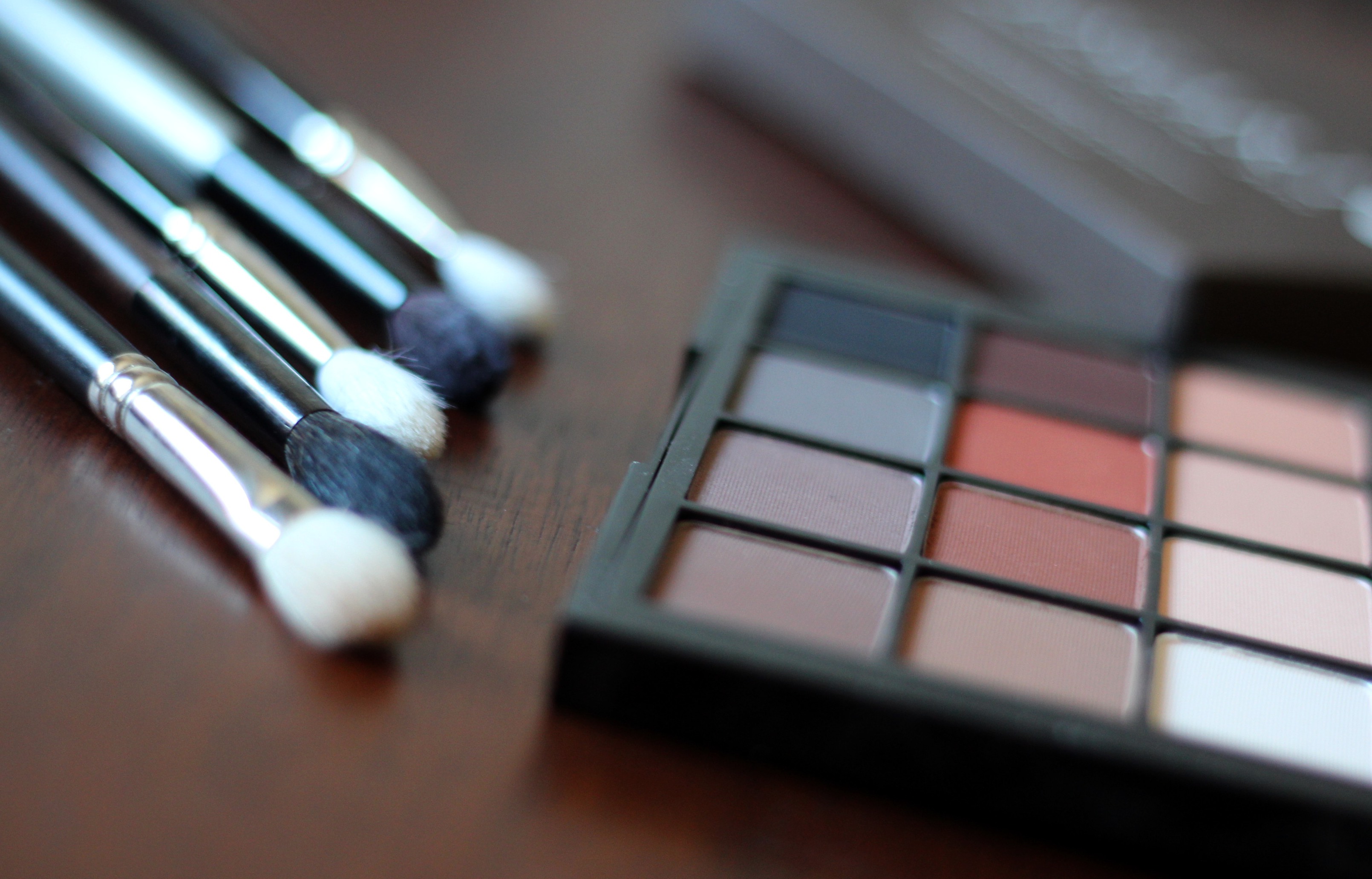
The light is somewhat blue in these images, the bottom left corner shade is a true black, and the shade just to the right of that is a lavender tinged, dove gray. Imagine the whole thing warmer than shown.
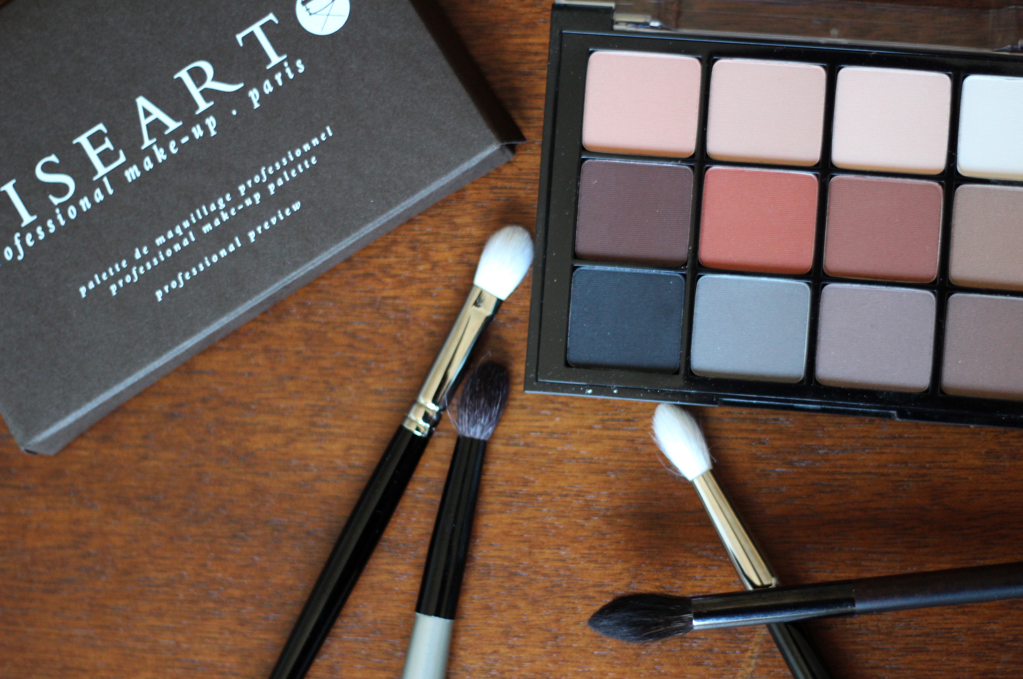
The autumn gift to self this year is the stunning Neutral Matte palette by pro French brand Viseart, whose expensive palettes are regularly sold out at Sephora. Honestly, for $80 it ought to be stunning. And it is. Beautifully chosen shades, not exactly creamy but no fall-out for me either, effortless blendability, great true pigmentation. Is it worth $80? That’s arguable, there are so many solid formulas on the market now that it is definitely not necessary to spend this much (at all) for great eyeshadow (See the Wet N’ Wild Comfort Zone palette). That said, if you are in the market to find a gorgeous neutral matte palette, I don’t think you would find this disappointing.
The shade selection reminds me a bit of the Kat Von D Monarch palette, maybe for that great sepia in the middle.
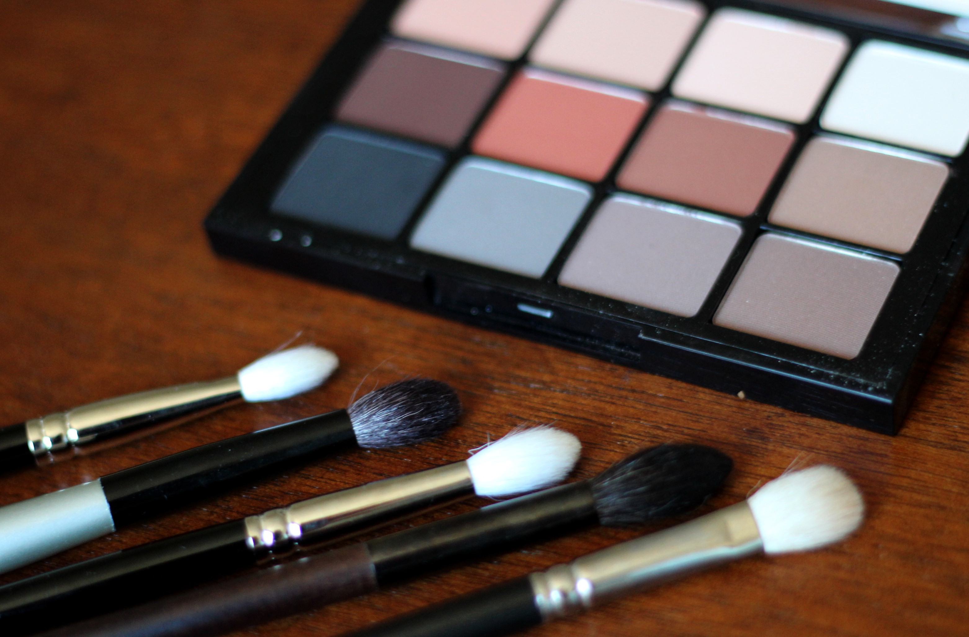
Eyeshadow brushes loving at the moment, L to R: Hakuhodo J5523, Paula Dorf Sheer Crease, Hakuhodo J142, Rae Morris 7 Deluxe Point Shader, MAC 217
I’m not converted to the cult of matte everything. If anything I tend to prefer any finish over matte, especially when it comes to skin. Of my favorite matte lipsticks I like the creamiest of the crop, and I think a little shimmer in an eyeshadow makes it significantly more forgiving in application. Mattes, though, are ideal for the kind of no-makeup sculpting I often find so chic and polished. This recent Lisa Eldridge look is a perfect example of the kind of makeup I mean; minimal, clean, natural, mimicking/enhancing the existing shadows and highlights of the face. Done well, this kind of shading is virtually undetectable, done well in another way, it’s slightly detectable but who cares because it’s so lovely.
I also really like that I can see myself using every single shade here (always such a shame when a palette has duds), and with a mix of cool and warm neutrals, especially if you have a few desired shimmer shadows on the side to complement, seriously versatile. I don’t especially care about a single palette being able to do everything at once, I don’t mind carrying a couple of things around, and this palette isn’t especially small anyway, so it was never going to win a convenience battle. It’s a selection of fundamentals.
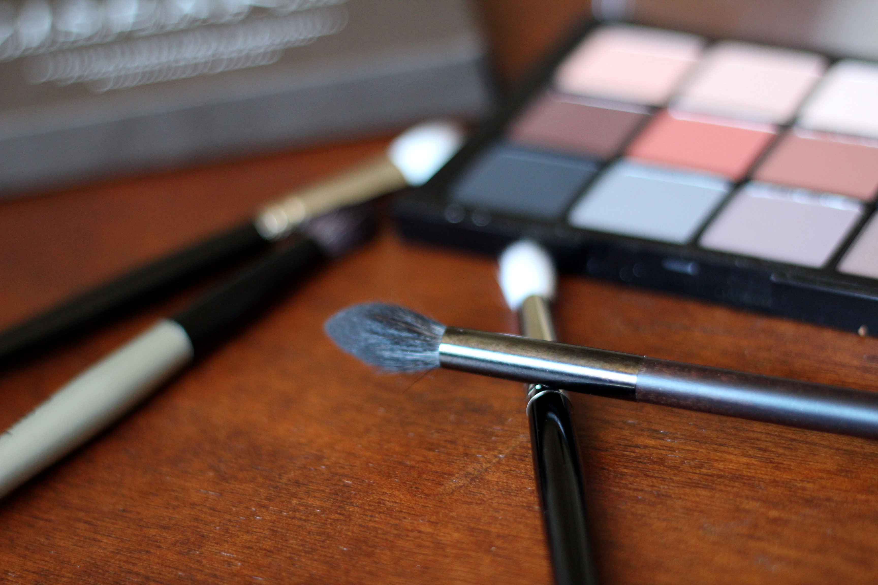
Special props to the Rae Morris 7 brush, which caught my eye after I saw Morris using it in this incredible makeup tutorial, which I found inspiring as far as how to think about sculpting an eye. She outlines some techniques I haven’t seen anywhere else. This brush has a dramatic taper to a point, making it great for blending, and great if you have a deeper socket, or want to give the impression of having a deeper socket.
This is the only palette I brought on vacation (I’m on vacation!), and I’m feeling good about the decision.
Happy autumn.
x