What is it about violet?
A bit of red, a bit of blue, beautiful on all skin tones and eye colors in some shade or another, unmistakably a color in the child’s sense, non-neutral, not of the earthground. Purple was, historically, my favorite color. The color that had, from the age one can identify discrete colors to, say, 13?, no peer. A sage green snuck in on it around then, and I grew more diplomatic and embracing in my preferences, but I remember an abiding love for purple.
Can you recall a time when all something had to be was a certain color to ensure success in your eyes? For me it hardly mattered what the thing was, so long as it was some compelling shade of purple. Preferably leaning toward violet, which—perhaps I have only made it up?—is more blue. So simple!
I am still like that with some shades. Even something quite worthless or otherwise unappealing can catch my eye if it strikes a chromatic chord. All that has changed is: the nature of the shade is more precise, and there is more than one.
Here are some of the violet lip things I like, ranging from lavender to fuchsia.

Revlon ColorBurst Matte Balm in Shameless, MAC lipstick in Heroine, OCC lip tar in Butch, NYX Soft Matte Lip Cream in Copenhagen, MAC pencil in Nightmoth, Buxom Full-On Lip Stick in Havana, ColourPop Grind pencil, Rimmel Violet Pop lipstick, Kat Von D Everlasting Liquid Lipstick in Bauhau5, NARS Audacious Lipstick in Vera
Though there are so many species of purple, I like shades across the spectrum. I think it’s not so much about finding a shade that works for you in the broad sense of warm vs cool or pale vs dark, but a much more particular question of finding specific shades within each region. I think this goes for all colors, reds and oranges, pinks and so on. And for all wearable things, really, not only lipstick. Lipstick is a good example, though, as it is produced in such a crazy volume of often very very very similar shades, and you can establish fine distinctions in compatibility within each shade family.
It means, too, that lipstick lives on those borders between shade names. It’s a great reminder of how hazy the distinctions between colors are, and how fluid a creature color is. I think we can forget this with our shorthand color names, forget that those names are abbreviating small worlds of visible color.
This ability to hone in on a precise shade is powerful because while vaguely hitting the target of a shade that is flattering to your complexion is effective, hitting the bullseye is devastating. The impact of the right color (colors, there are many) is incredible. You can look more awake, healthier, arresting, demure, sultry, chic, classic, alive in some new, different way to your usual, everyday aliveness. If you haven’t yet had this experience…I’m pretty sure you need to try on more colors.
There is the added appeal of purple being decidedly outside the realm of typical lip colors. It stands out. Whatever the shade, it reads in bold print.
Mini reviews:
Revlon ColorBurst Matte Balm in Shameless : Love this formula, this is not the best of the shades in terms of payoff but: drugstore purple! This is the truest purple of the bunch, the closest to your rainbow purple.
MAC lipstick in Heroine: Needs a lip pencil but a great, medium purple for yellow or olive skin tones. It’s bizarrely bright, and fantastic because it is so, so, so not your natural lip color. I don’t know of anything natural that is quite this color.
OCC lip tar in Butch: A pain to apply but really fun colors, and they stay put. This hovers on the border between lavender and powder blue. Good to have a few fun colors like this, I say.
NYX Soft Matte Lip Cream in Copenhagen: was just talking about this, these can be messy to apply as well but great colors and a great price – this shade the darkest of the lot: autumn all over.
MAC pencil in Nightmoth: MAC pencils are a little dry but this also means they don’t move around on you and make a solid base. Nightmoth is a deeply pretty pinky aubergine.
Buxom Full-On Lip Stick in Havana: I don’t love this formula, somewhat patchy and smells poorly perfumed (semi-disguised play-doh), but this color is a great dark aubergine if you stick with it. Actually I don’t at all recommend this, but I don’t dislike it enough to ditch it, quite.
ColourPop Grind pencil: quite pleased with these pencils. Decently creamy, nicely pigmented, great out-of-the-box color selection, $5. This is a great match for MAC Heroine, just a little less yellow.
Rimmel Violet Pop lipstick: an easy, bright raspberry. Keep it up, Rimmel.
Kat Von D Everlasting Liquid Lipstick in Bauhau5: A vivid hot-house fuchsia. Lips that practically leap off your face. Fantastic long-wearing formula.
NARS Audacious Lipstick in Vera: A perfect warm aubergine. Slick and creamy formula, really lovely. As with most formulas, some colors perform better than others.
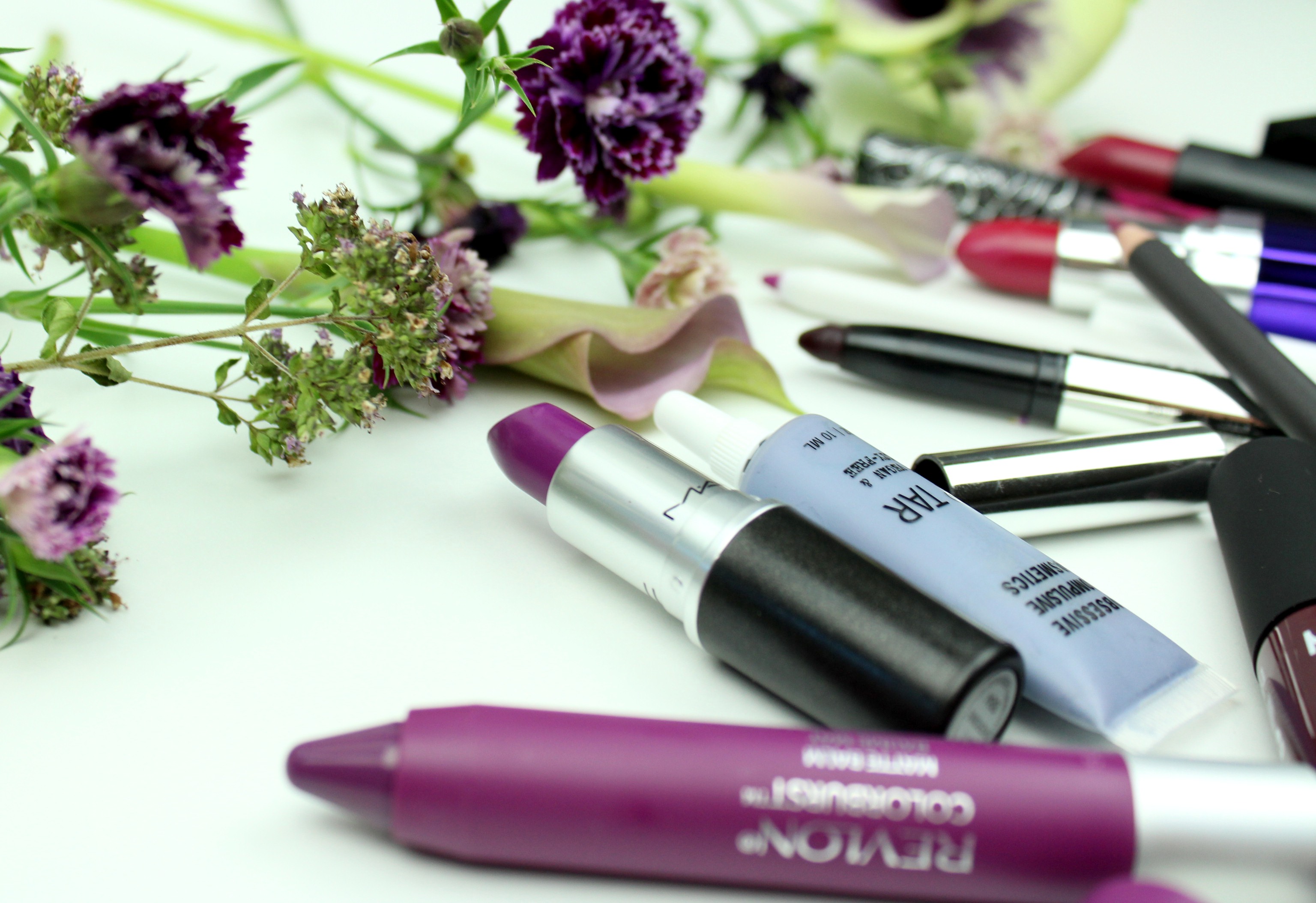
And some swatches done haphazardly on the back of my hand, taken with my phone, in a different order, with Revlon forgotten. You’re welcome!

MAC Heroine, MAC Nightmoth, Buxom Havana, NYX Copenhagen, KVD Bauhau5, ColourPop Grind, Rimmel Violet Pop, NARS Vera, OCC Butch

sweet william, oregano, mini cala lillies
x