I’ve been wanting to try to do my own mehndi for a really long time now, years. I really like the concept of a tattoo— and have a healthy appetite for tattoo reality shows—but I’m not yet drawn to any idea so powerfully that I want to wear it permanently. Enter henna, that clever, versatile dye.
It’s a different creature, really, than the etched precision of ink. It has its own history, and its own style, which varies from one culture to another, and lends itself beautifully to modern hybrids of tradition and innovation. Many designs have ancient origins and ancient meanings to match, ranging from simple patterns and shapes to those astonishing intricacy. You know how I like astonishing intricacy. If it is somehow tied up with wearable decor, so much the better.
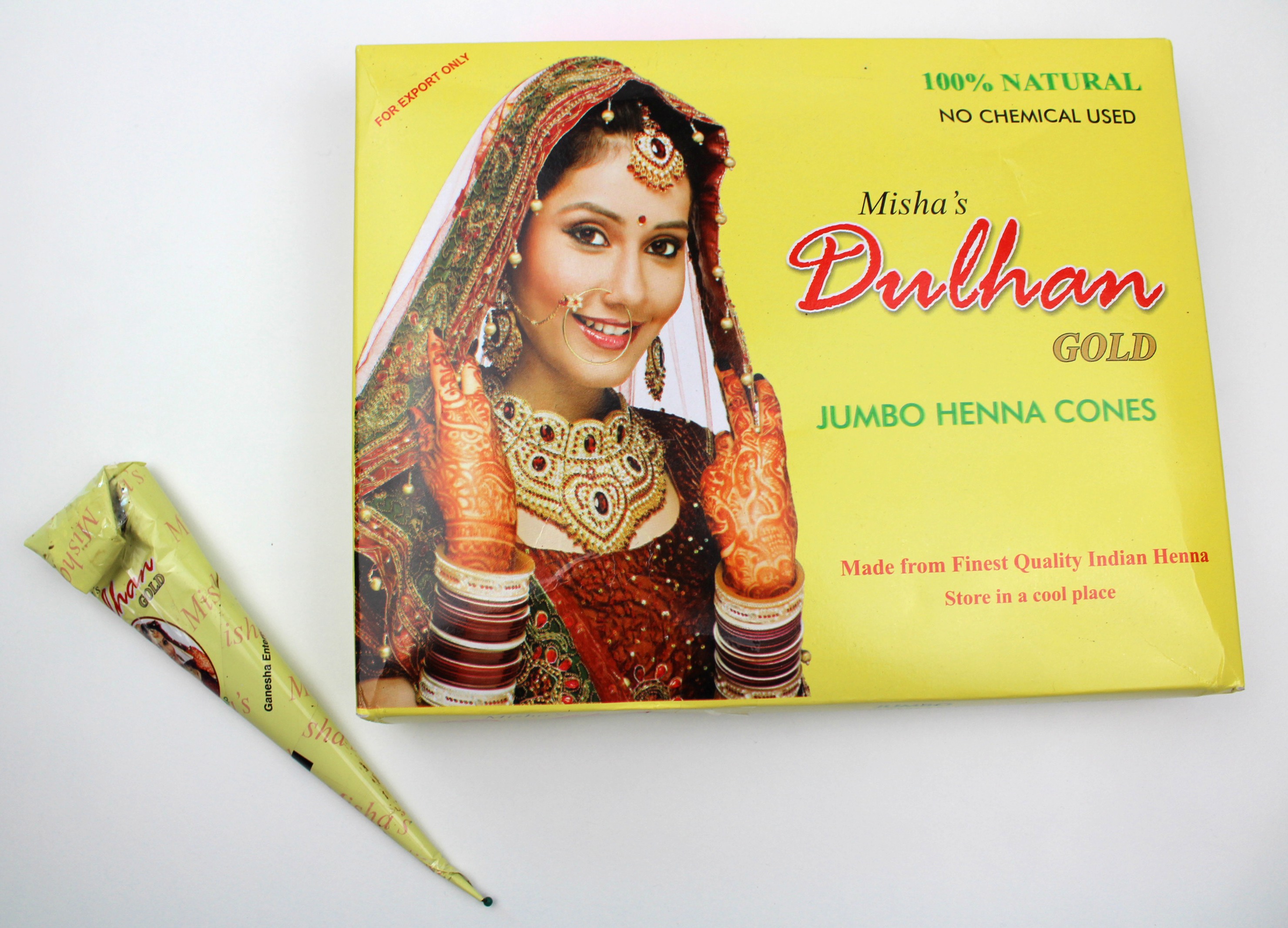
Somehow I wasn’t able to make the time for the project until I gave up, at least temporarily, on the idea of mixing my own henna paste, and got the ready-made cones (thank you, eBay). I also needed a fair chunk of time, as the henna can take a while to apply and to achieve a dark, long-lasting stain it stays on the skin for at least 4 if not more like 6-8 hours. I had to decide on a pattern, too, which we won’t talk about how long that took. I opted for something geometric and straightforward to start. If you are one of those people who can’t bear to look at feet, you’d best tap out now.
Designs on the feet connect the spirit, mind, and body to the earth. I like this kind of physical symbol or reminder, perhaps because my memory seems to need all the help it can get. And I like my feet. I like them as they are, just as I like my face as it is, but it’s appealing to embellish them all the same. It’s not exactly that I like them more when they are embellished…but I like the novelty and the energy of embellishment.
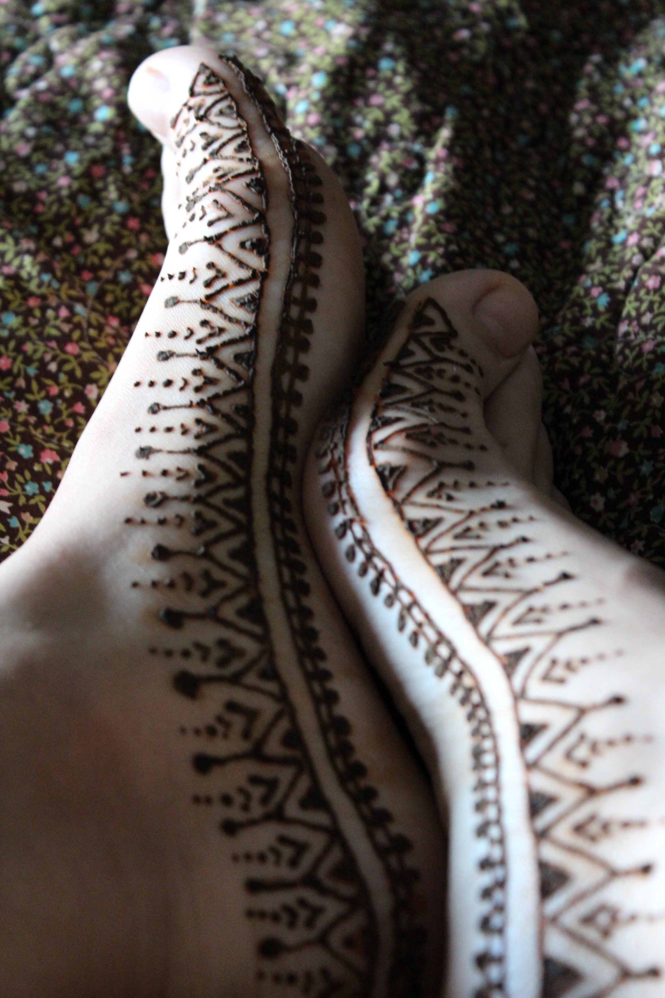
I washed my skin and and rubbed it with eucalyptus oil (diluted) to prepare it to receive the dye. Henna also has an earthy, peculiar [though not exactly unpleasant, though not exactly pleasant] smell, which the eucalyptus combats. You snip the end of the cone to the desired diameter and essentially pipe the henna paste on, like frosting a cake. You can use a transfer to create the design or just freehand it as I’ve done here. I had a pile of cotton buds and toothpicks on hand to quickly remove errors before they became part of the story. I looked at a few hundred images and cobbled together two that I liked to make this design. You have to take care with anything around, as henna will stain a good many things if given the chance.
You keep your design intact for as long as you can manage, moistening it periodically with a lemon juice and sugar solution (I only spritzed mine with diluted lemon juice because I’m always going off-recipe, which seemed to work fine). It eventually starts to flake off and, in my case about 6 hours later, you scrape the remainder off.
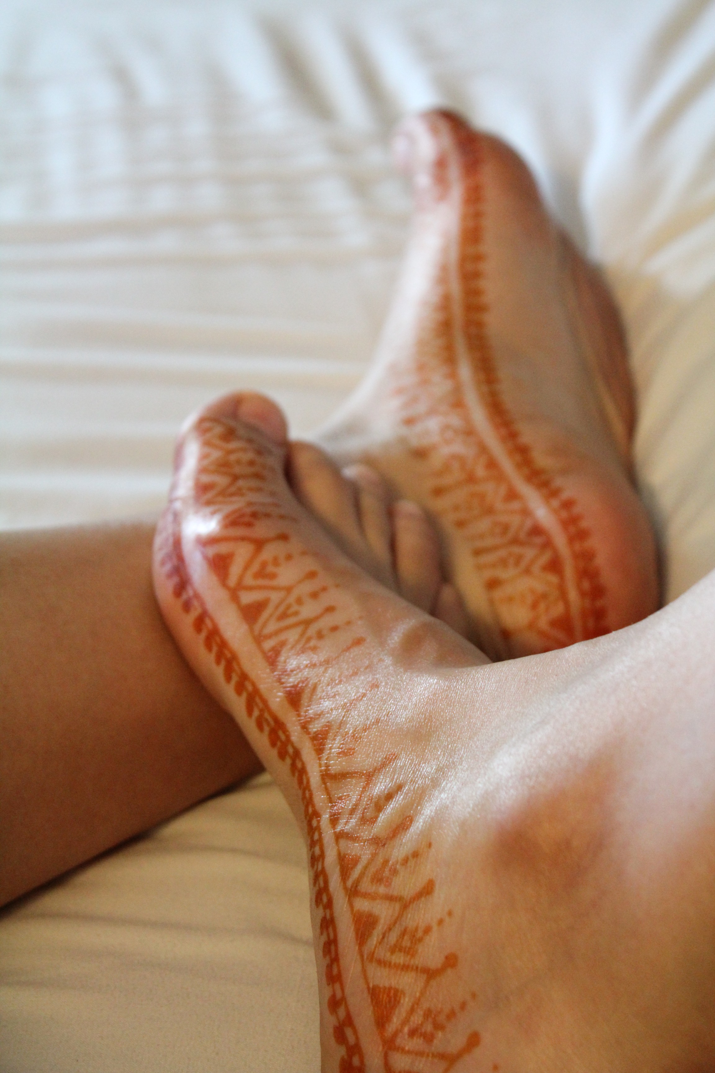
The initial stain is a bright rust, sepia, basically my favorite color ever.
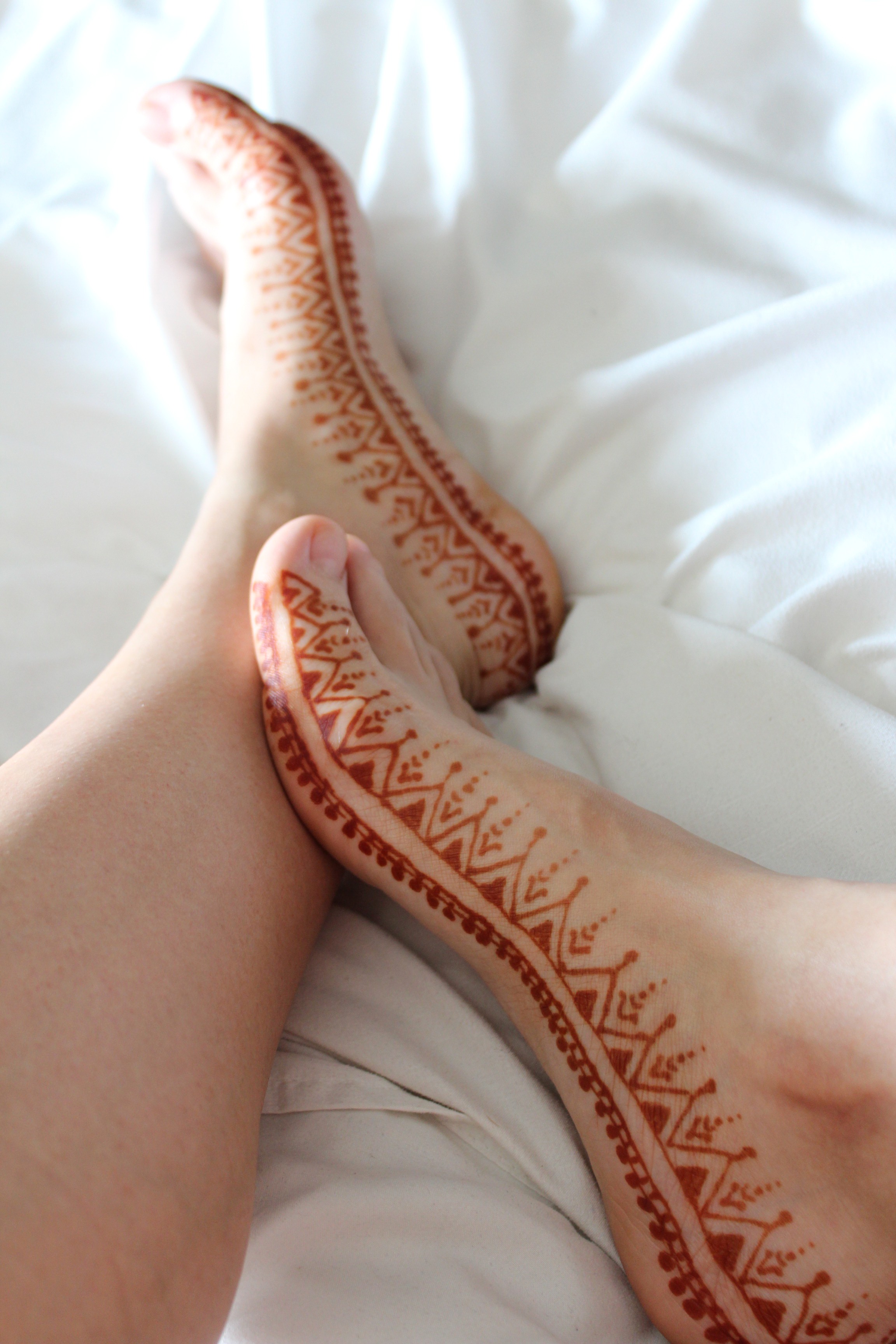
As it oxidizes it darkens into a deep, warm brown stain that lasts about 2-3 weeks. There are strategies for making it darker and longer lasting but I was only willing to be inconvenienced up to a point, and I’m delighted with the results of my first foray.
I don’t like to miss an opportunity to decorate myself in a new, personal way. And it’s so like me to want to do it myself, though I have seen mehndi artists at some of the Indian shops in the area. [Perhaps I’ll visit them after botching something with my non-dominant hand.] I find it extremely appealing, fitting, beautiful.
I absolutely love it.
I’m already thinking of what to try next, I like this medium so well. It’s versatile, flexible, it needn’t be too precise, neither in execution nor interpretation, and its duration is a comforting balance of not-quite-fleeting and not-remotely-permanent. And it’s beautiful.
Have you tried it?
x