spring pinks

IMG_1759

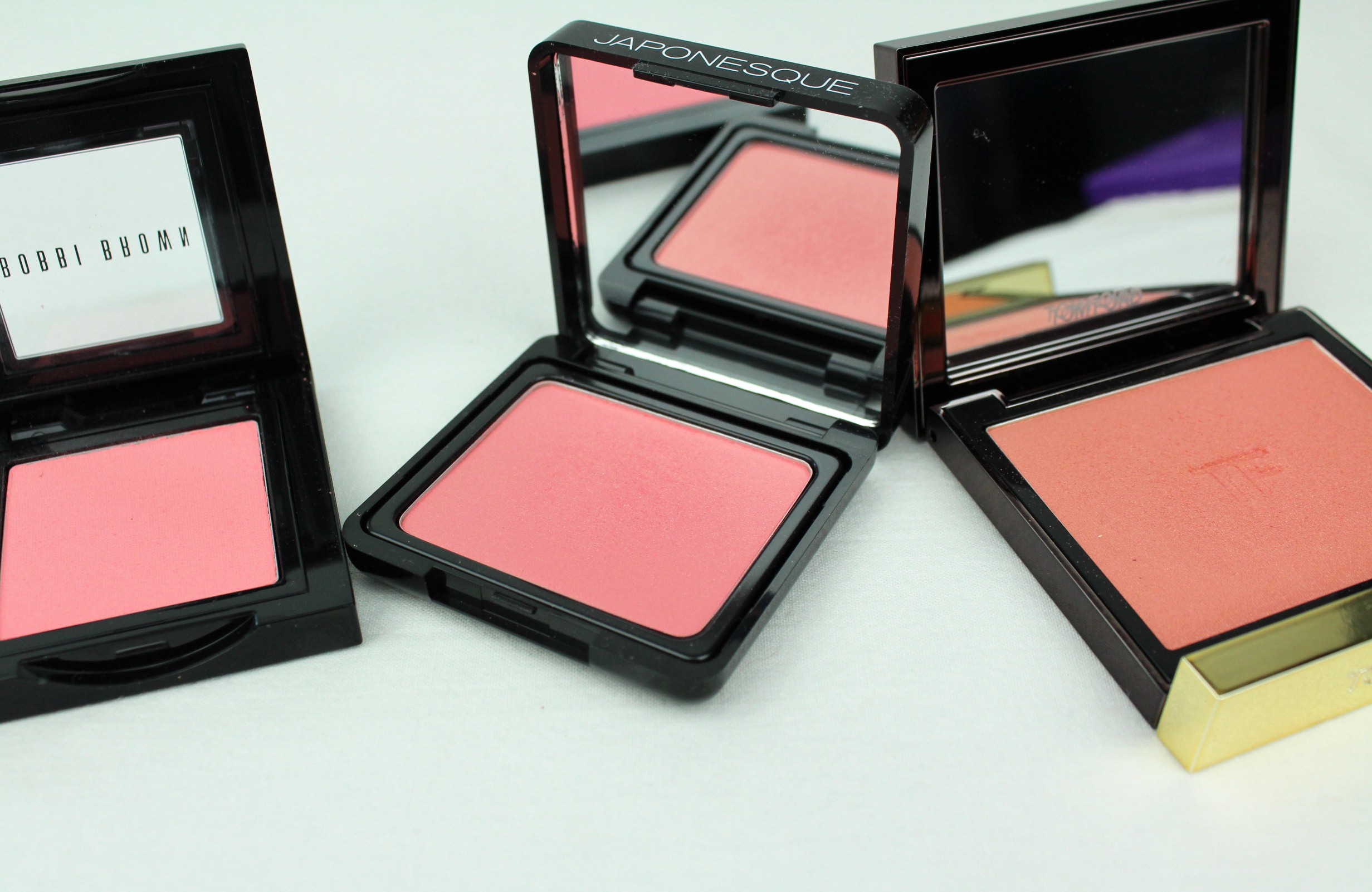
Bobbi Brown Pink Coral (wearing here), Japonesque #3 (wearing here), Tom Ford Love Lust (wearing here)

Here are a few of the blushes I’m reaching for so far this spring. The Bobbi Brown blush I’ve mentioned before, it’s the brightest and the only non-shimmery blush in this crowd. The Japonesque blush is just a fraction darker, with some fine, subtle gold shimmer, and the Tom Ford blush is more muted and peachy with a comparable amount of gold shimmer, a sophisticated cousin of the Japonesque shade. With Love Lust I’m more likely to do a (subtle) 80s diva streak up the cheekbone rather than a pop on the apples of the cheeks. Milani blush in Luminoso is a great drugstore alternative, about $10 and with a similar effect on the cheeks in terms of the quality of the shimmer (high, fine). Though more distinctly coral/peach the shade is quite sheer (I can see this as a positive, easier not to put too much on in one go). I mention it here anyway because I reach for it under the same circumstances and for the same reasons I would reach for any of these pinks.

IMG_1768

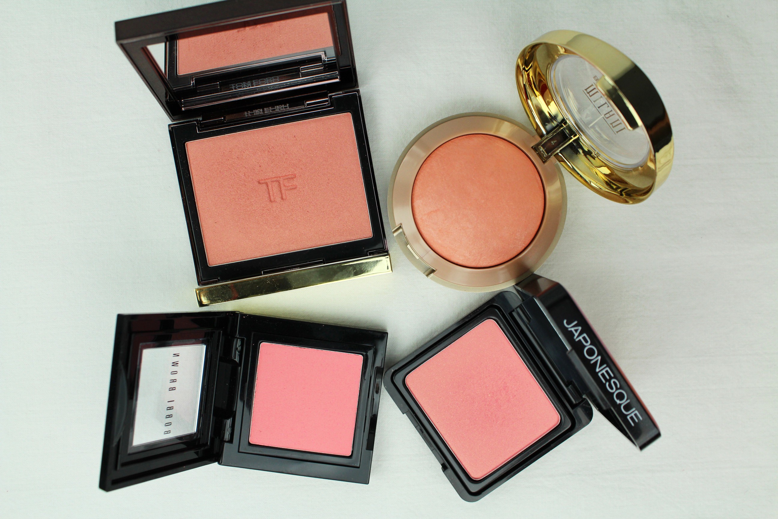
Clockwise from the top: Tom Ford Love Lust, Milani Luminoso, Japonesque #3, Bobbi Brown Pink Coral

One of these blushes is often virtually the only makeup I use for the day, with perhaps a little highlighter and tinted lip balm (maybe some bronzer, mascara…OK, OK. Virtually).  If I only have time to do one thing, though, that thing is always adding a bit of blush. Blush, for me, gives the maximum payoff for the minimum effort, an instant infusion of life into the face.

These are great blushes at any time of year, really. Like any that suit you. A good pink blush will see you through all weather.

the Kat Von D Monarch palette

If you’ve been reading for a while you may remember that I’ve been looking for a sepia eyeshadow, and was for a while considering the Kat Von D Ladybird palette, though in the end I had too many reservations and didn’t go for it. I’m so glad I didn’t, as Kat Von D released two new palettes this month with new colors and formulas, one warm, one cool. Guess which one I liked more?

IMG_2737the warm one

I picked up the Monarch palette, which wasn’t even on the shelves yet in Sephora last week but they sold it to me anyway. The colors were, are, irresistible to me. This is what I wanted the Urban Decay Naked palette (which I don’t have (or want) in any incarnation) to be. Taupe, beige, bronze, gold, champagne, brown, russet…everything I like best, and with lovely, buttery textures.

IMG_2740

See that shade on the left?? Are you seeing??

This already has great reviews online, and it deserves them. I haven’t had much time to play around with it yet but I’ve been swatching and musing, and I am pleased. I have some reservations about the top right base shade, which has some oversized glitter, but this is the only negative to report so far. This should be on shelves officially in the next couple of weeks, so if you’re near a Sephora (this is a Sephora exclusive), I urge you to check it out. The other palette is nice, too, with blues and stuff, but, you know. This one is better.

I’ve been making a lot of decisions based primarily on color lately, and color seems to be playing an increasingly significant role in my vision generally (in all types of choices). Somehow color is jumping out at me more, seems more important, more powerful and more poignant than it has been in the past. It’s always hard to tell if I am imagining these things. Still, it does seem I am struck down (smitten, really) more often by some singing color these days. I am the same, perhaps, only more so.