powder blu

Zoya’s Blu nail polish is just what I hoped it would be, a pale powder blue with the barest hint of lavender, opaque in two coats.

zoya blu nail polish

You know how you can be drawn to shades of polish you wouldn’t really consider in any other wearable life category? Not that I’m virulently against powder blue but I don’t own anything else in this shade, hardly anything that could be considered pastel at all, and that’s not a coincidence.

zoya blu nail polish

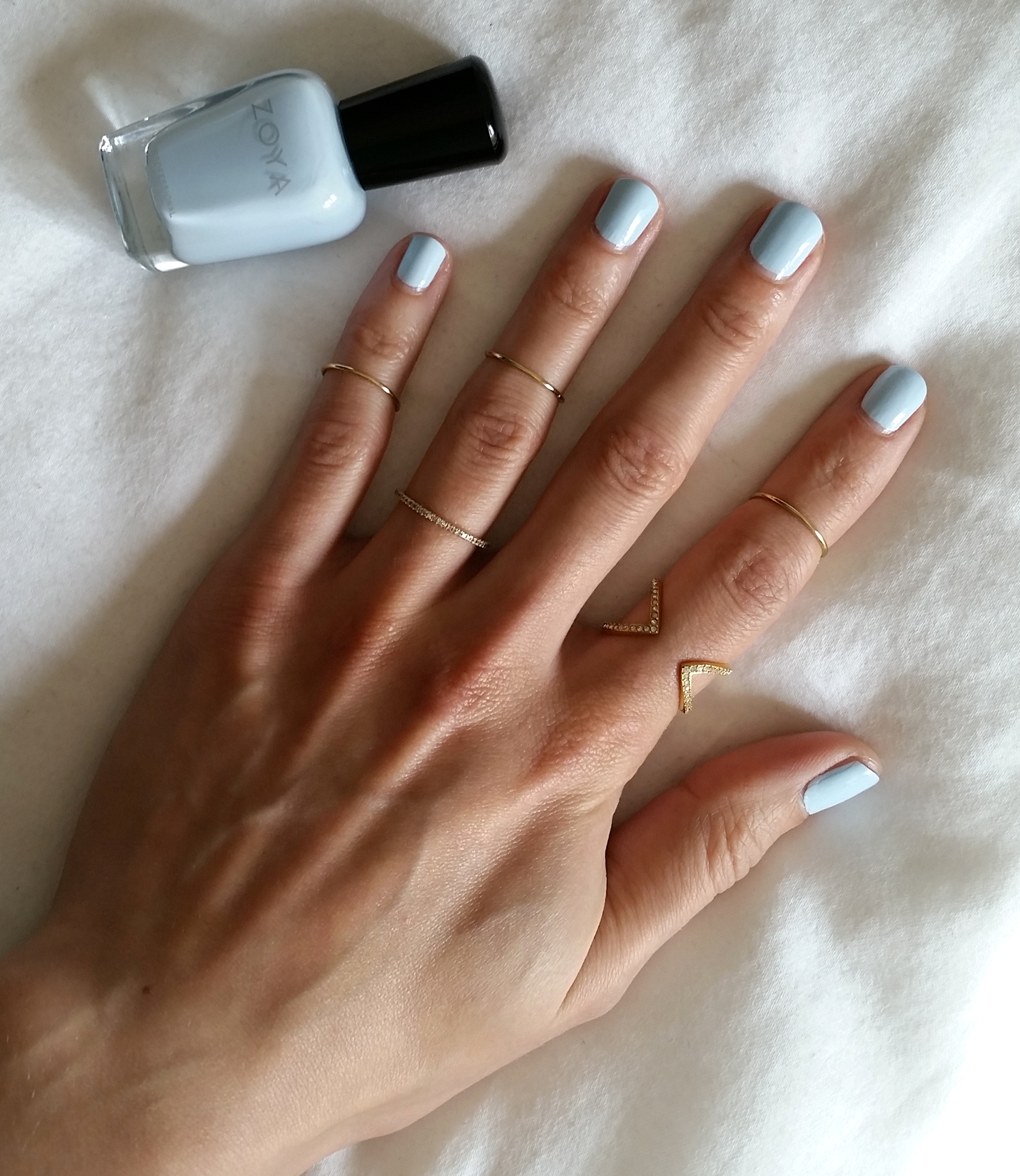
Michael Kors open arrow ring, other rings…

In the land of nail polish, though, suddenly an entire different set of criteria seems to be at work. The touch of lavender makes the blue pop against my olive skin, the pale, opaque color pops on the hand as white would, but in a softer, more intriguing manner than straight white. I’m not certain why this doesn’t convert me to the shade all around…but it doesn’t. Though maybe it should?

Nails, like shoes, are a style zone of their own, with bold colors and patterns not at all unusual, even arguably boring, now, with a demand for more and more creative designs to catch the eye of the machine of cultural interest. I appreciate this, though I wish this trend would spread to more and more categories. Which it is, I think, spreading…but, you know, I wish it were faster.

zoya blu nail polish

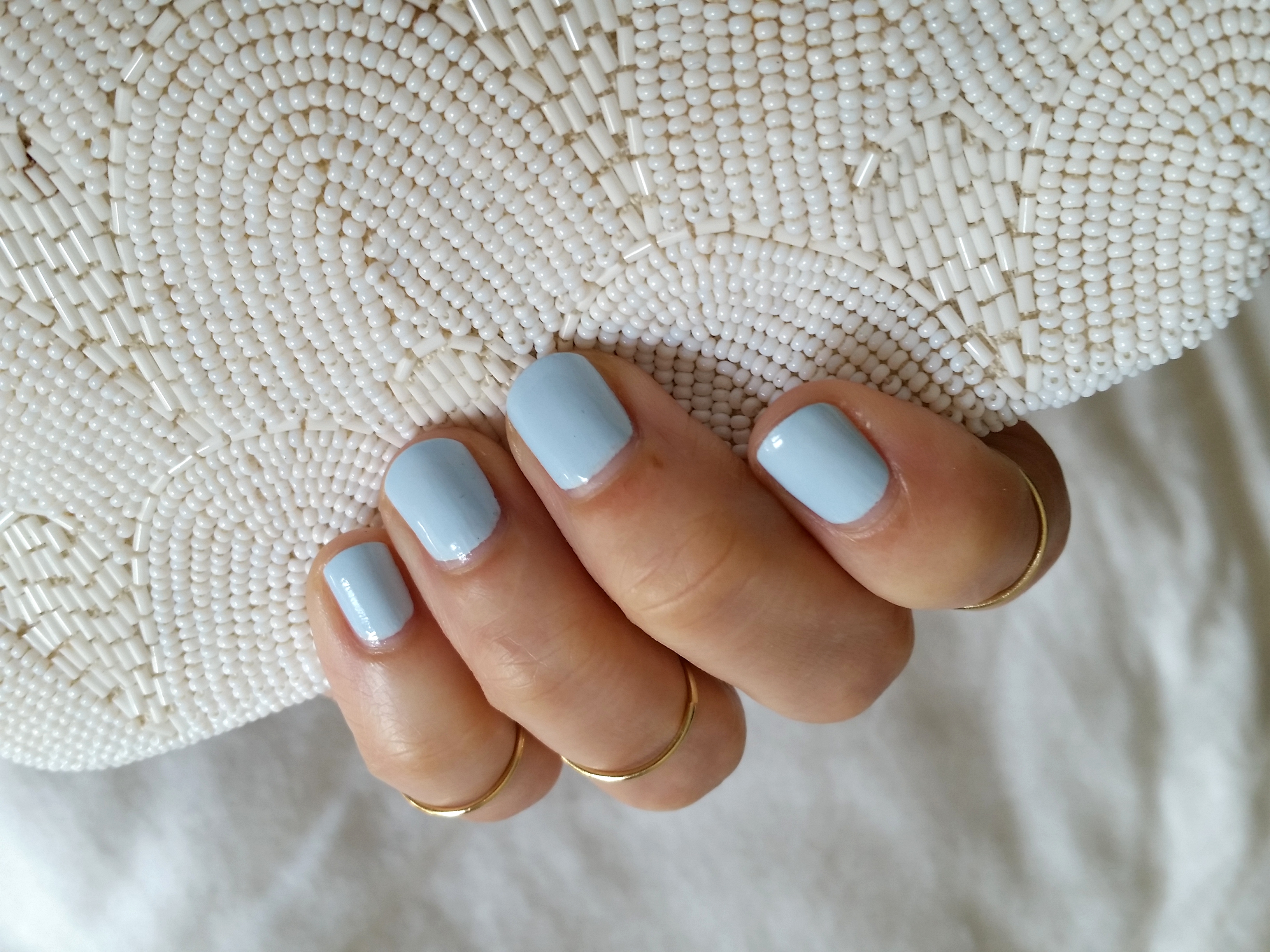
Vintage beaded clutch

Full marks to this shade for being pigmented enough (not too close to white) to pair well with every white accessory ever.

x


distraction: bold blush

I scroll through so many made-up faces in the course of my style and beauty browsing, online or in magazines, that I rarely give a look much attention. Perhaps I note liking a certain color that is used (probably the shade of lipstick), or thinking that there is something appealing about the peculiarity of the model’s face, but it’s extremely uncommon that I pause, am arrested. Am interested.

Stumbled across this image in a more or less unrelated marie-claire article about pro make-up tips, wherein this image was a sort of useless illustration of a category heading in the piece. [Because you can’t have an article without pictures!] I forgive it this superfluity, however. This is a stunning, strange look. The kind of look that makes me want to sit down and play around with make-up.

54823ea052e58_-_mcx040114berosacea001

The pale pastel eyes and lips seem like your usual spring stuff but then these great windburned cheeks pull the look well away from the shores of the ordinary. This is bold, beautiful blush. I love when a look conveys the idea of wearing too much blush on purpose. That is, not too much blush, exactly the amount desired. It seems to me this is the trick with anything outlandish or unconventional: to look as if you did it on purpose.

This is editorial, yes. I mean, this is a lot of blush. The look is so fierce, though. The icy blue of the eyes, such a cool color…probably terrible on me but it is so great here I want to secretly try it anyway. Did you see the Lisa Eldridge tutorial of Tippi Hendren’s make-up from Hitchcock’s The Birds? That was a look that stuck with me, that I also wanted to recreate faithfully, reminds me of this eye look. Pinned.

There’s something to be said for too much blush. It’s dangerous territory but with treasures to be unearthed for the adventurous, those who go beyond the rookie realm of gauche overapplication into that of decisive, savage color.

image via marie-claire.com