NARS Liberté blush

As it gets colder I turn from the orange and coral blushes of summer and reach for darker shades, especially those within that rosy red spectrum that approximates a cheek kissed by winter. My favorite might be NARS Exhibit A, pretty much a straight red, but this new acquisition, another NARS gem, Liberté, is a beautiful, approachable, alternative.

IMG_9382

This is a rosy terracotta with an extremely subtle shimmer which, as far as I can see, is only distinctly visible in the pan and doesn’t translate to the face. This color is so pretty, no? This is the kind of sophisticated pink I find so versatile, so easy to wear. To me this shade is perfect for the transition from summer to autumn but of course it would be lovely any time. I’m sure there are dupes out there but I don’t have anything else quite like it.

Still loving my NARS yachiyo brush, too.

IMG_7388

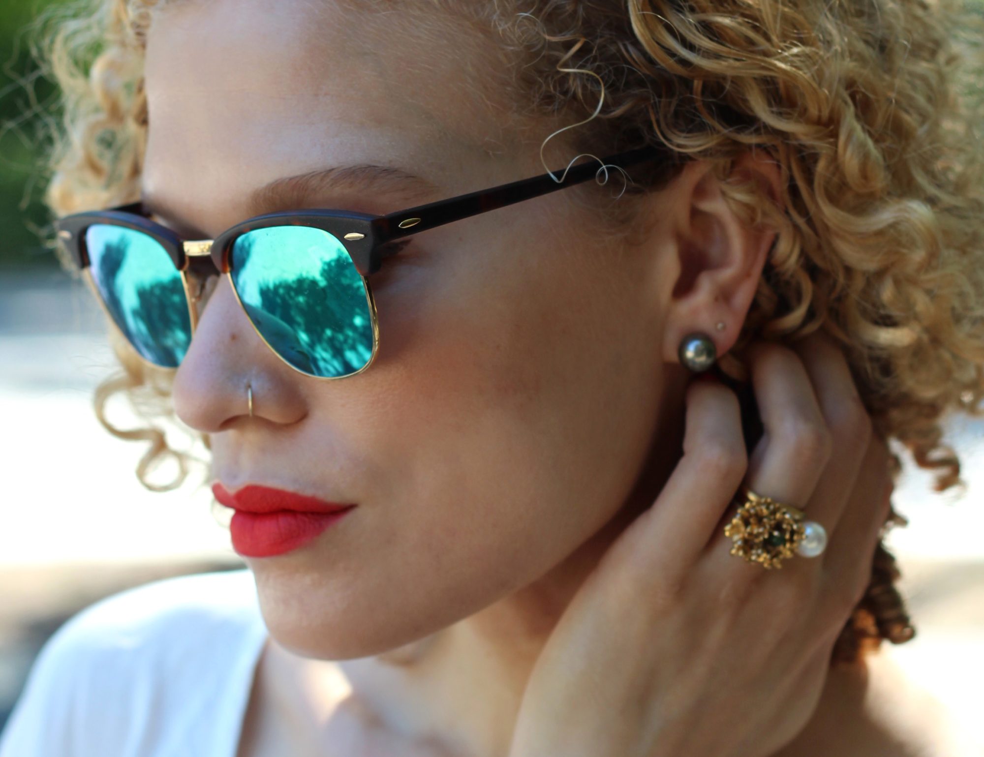
Wearing it on my eyes as well, with a little bit of brown in the crease for depth and some brown eyeliner (Urban Decay 24/7) to delineate/prevent that pinkeye effect one can get when using straight pink around the eyes. It comes off quite peachy and warm on me. Oh, this mascara is from a little Canadian brand called Geisha Ink and is excellent, highly recommended by shamelessfripperies (if you have expensive taste, definitely check her out).

IMG_7406

If you only get one thing from NARS, make it a blush, they are famous for their excellent quality (also notorious for breaking easily, though). Unless you don’t need any blush, in which case get one of the lip pencils, satin or matte.

IMG_7399

No lipstick!

x

the autumn/winter palette

So-called autumn colors are consistently my favorites, regardless of the season. Deep jewel tones, warm earth tones, any color a leaf might conceivably turn, the dark, sophisticated cousins of their spring/summer counterparts. There’s a lot of overlap between classic autumn and classic winter shades and I don’t make much of a distinction, though if forced I would say it is the warm, rusty, browned shades that dominate the autumn palette, and the winter palette substitutes that warmth for still more heavily saturated jewel tones.* Ex. the turn from the oxblood lip to the deep, blue-toned red lip (or burgundy to bordeaux). Ex. the turn from copper and gold to amethyst and jade.

*Jewel tones meaning (at least, I mean) colors somewhere on the spectrum of a true gemstone color, just darker or lighter, paler or more vibrant. A questionable phrase as the terms jewel and gem are hazy, and could really be said to include every color thanks to the diversity of minerals, but when we talk about beauty and fashion we understand the term to mean saturated and vibrant, often dark colors. So, OK, fine. Jewel tones.

IMG_9359

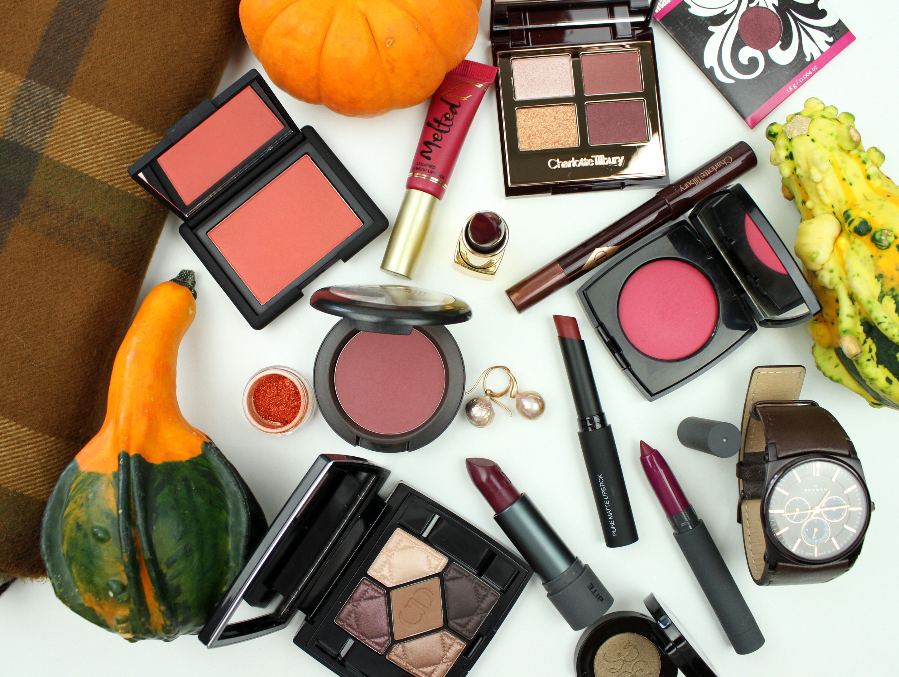
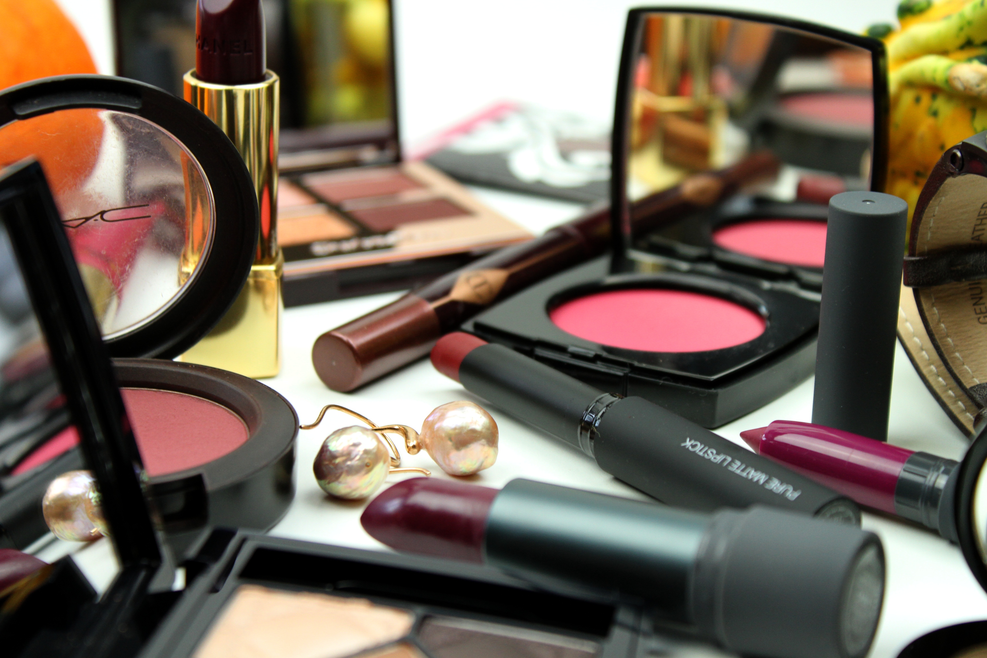
I like this transitional period wherein it’s not too late (I mean, it’s never too late) to evoke the rust and copper of autumn, and the muted violets, rosy reds, and deep greens of winter are fair game. I’m especially into plummy, bordeaux shades this year. Definitely another burgundy/bordeaux lip round up coming soon. Will be telling you more about some of my favorites pictured here as well, mostly quite new, and some real beauties.

IMG_9364

Really the only thing to do with piles of beautifully colored objects is to arrange endless configurations of them. Right? I, at least, never tire of this.

For me makeup is only fractionally about the medium/texture/formula, and primarily about the color. I am not even shopping for a category, sometimes, not a blush or a lipstick or a shadow (many of these can be multi-purpose, anyway), I am shopping for a color. An excellent formula is then a happy bonus. I have a few lipsticks that are lovely in texture but a little eh color-wise, and they don’t get much love. On the other hand I have some mediocre shadows that I make work because I like the colors so well.

Color is also the most dangerously effective justification for getting another thing, makeup-wise. I think I may accurately blame much of my stash on color preoccupation.

x