I have three very specific and very different ideas about what color I want to wear on my cheeks this winter.
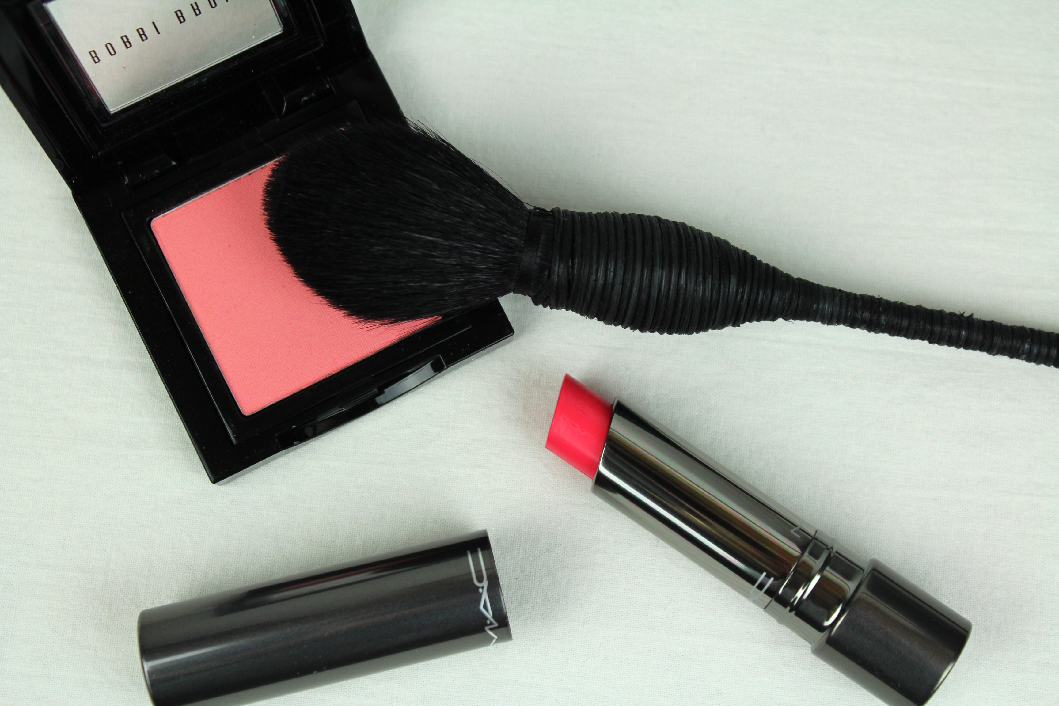
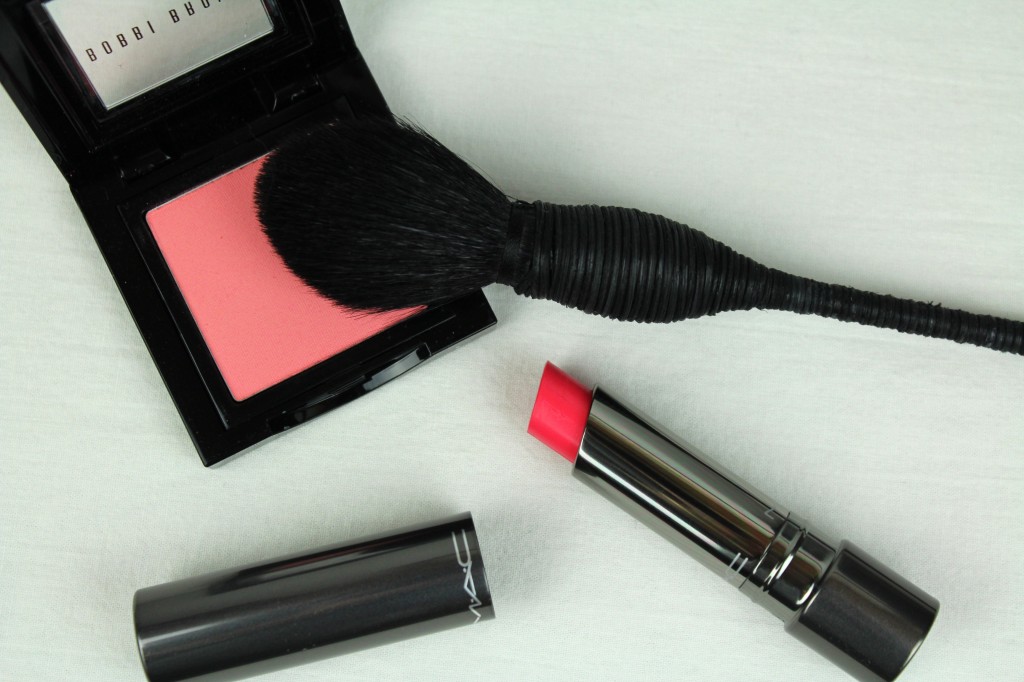
The first*, the acquisition of which has been on my mind for some time, is this coral-leaning pink, Bobbi Brown’s aptly named Pink Coral. There are a number of peachy pink blushes out there but this one stands out to me. It stays nearer to the pink camp, trespassing only slightly into peach/coral territory, and has for me that instant, visceral appeal that certain colors have for whatever reason. It’s hard to imagine a skintone this would not suit, it is so near to the embodiment of ‘the pink of health’. This shade walks that line between bright and pastel, vibrant but not in the way of neon or bubblegum. Other blushes I categorize as pink look dim, almost mauve in comparison. It also comes highly recommended by Guardian beauty editor Sali Hughes, the most sensible and appealing beauty editor around as far as I can see. How pleasant, in the bleak midwinter, to forego the dark autumn palette and go straight to summer pink.
*The second and third [ideas] are a true red and a deep berry, respectively, about which more later.
I once came across the advice (can’t recall where now, rubbish memory) to select a blush color that approximates the shade you actually blush, or the color your cheeks go in the cold, which is particular to you. I don’t think I’ve ever witnessed myself blushing but in the cold my cheeks turn a faintly rosy red. Mostly red. [Isn’t it a shame that beyond a certain threshold the red is not confined to the cheeks and simply splotches over the entire face?] If going for a natural look I think this is excellent advice, though I think most people could look well in a range of shades, each having its own effect. I don’t naturally blush pink…but you don’t know that. I don’t blush orange, either, and my lips aren’t ever burgundy by their powers alone. Natural isn’t always the goal.
It is this kind of thinking that helps one justify getting several blushes in one season. All quite different, you see!
And it was impossible to justify the above without justifying in tandem the acquisition of the NARS yachiyo kabuki brush, which is, as you see, a thing of beauty. The handle is hand-spun with black wisteria (!), and the hairs are densely packed in the kabuki style yet gently tapered for a soft diffusion of color. I cannot count the number of favorable reviews I have seen on this brush, which has been on my wishlist for years. I wish I’d gotten it sooner as it excels as promised at the sheer, uniform application of highly pigmented powders (otherwise quite scary, those powders). This is the kind of brush that will do most of the work for you.**
**Look into good brushes, which need not mean expensive though in some cases I find it does not mean cheap. A few discerning brush purchases make for an excellent investment (and a bad brush is waste of time and money both). Tasks that used to be tiresome and difficult become suddenly pleasurable and simple.
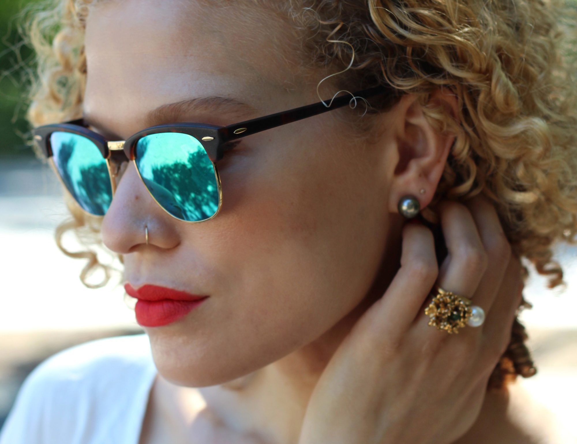
Then I went out in search of something else entirely and came home with this little gem, MAC’s Huggable lipcolor in Love Beam, an emollient, high-shine formula that performs beautifully and is very much in the same pink coral vein (which I attribute not to conscious matching but to a phase of affinity to this kind of shade). It seems silly to say when I have so many lip products but I really have nothing else like this color. Must look into pink more, I see. Pink (really red but also pink by association) is opposite green on the color wheel and sets off green and hazel eyes especially.
So many brands are coming out with these lipstick/nourishing treatment hybrids now and the formulas are getting better and better. This means uniform depositing of pigment, uniform fading (no issues with patchiness), pleasant sensation on the lips (a bit tacky, this formula has something of a lipgloss about it). I’m wearing both this and the blush with the chunky knit scarf, though I find you really have to whack blush on for it is show well in photos so it’s not a great showcase. I’ll point it out in future shots. I certainly anticipate getting a lot of wear out if it.