looks to try right now: earth tones

While I often find a makeup look interesting or beautiful, it’s relatively uncommon that I actually want to recreate it on myself. I’ll make a mental note of elements I like here and there, which notes presumably accumulate in my unconscious to manifest at some later time, but usually don’t want to just copy the exact look.

Unless it’s this gorgeous.

josephine-skriver-hung-vango-13-613x409

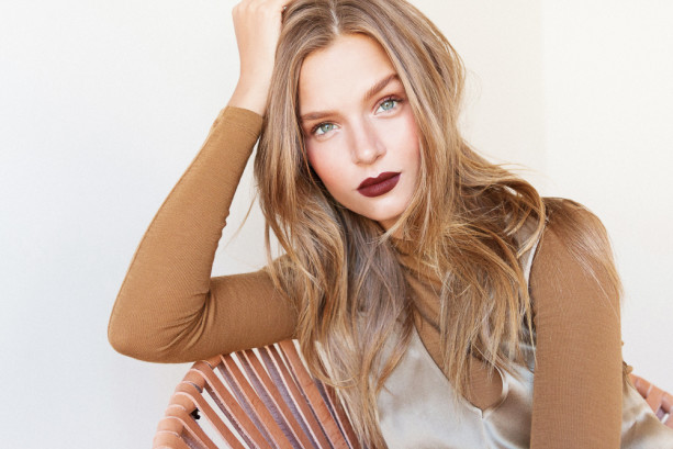
This is the work of Victoria’s Secret makeup artist Hugo Vanngo [as featured in intothegloss], who obviously does restrained elegance well. The article was about a fresh take on earth tones, and I really love the first two looks he created (full article here).

The contrast of the deep garnet lip with the minimally contoured eye is so chic. The eye makeup is almost undetectable, with most of the focus going to the enhanced brows and rosy cheeks. Key that he didn’t bring the blush too far toward the center of the face, which keeps the look grown up. Imagine a vertical line coming down from the outside corner of the eye, this blush only slightly crosses that line, and only at the hazy edge of the zone of color. Compare this with a youthful blush look centered on the apples of the cheeks – a distinctly different look (urge you to try this at home).

josephine-skriver-hung-vango-111-613x409

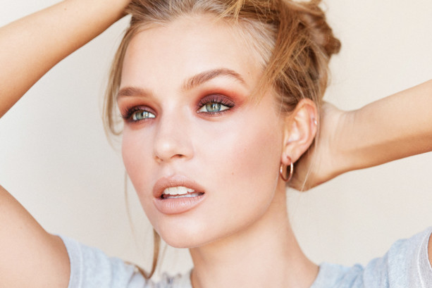
This second look is LIFE. I love everything about the colors on the eye here. A prune lid with a rusty brown, fairly graphic crease color. Defined lashes but still natural (not doll drama, which I personally don’t like on myself). The faintest presence of bronzer and a peachy nude lip to allow the eyes to dominate…perfect. Shades of violet look lovely with every eye color, and if a crayola purple is too much for you, this kind of muted jewel tone (amethyst tempered with taupe, violet tempered with brown) is a beautiful way to go.

Will have to remember to document trying these looks out.

images via intothegloss

the Kat Von D Monarch palette

If you’ve been reading for a while you may remember that I’ve been looking for a sepia eyeshadow, and was for a while considering the Kat Von D Ladybird palette, though in the end I had too many reservations and didn’t go for it. I’m so glad I didn’t, as Kat Von D released two new palettes this month with new colors and formulas, one warm, one cool. Guess which one I liked more?

IMG_2737the warm one

I picked up the Monarch palette, which wasn’t even on the shelves yet in Sephora last week but they sold it to me anyway. The colors were, are, irresistible to me. This is what I wanted the Urban Decay Naked palette (which I don’t have (or want) in any incarnation) to be. Taupe, beige, bronze, gold, champagne, brown, russet…everything I like best, and with lovely, buttery textures.

IMG_2740

See that shade on the left?? Are you seeing??

This already has great reviews online, and it deserves them. I haven’t had much time to play around with it yet but I’ve been swatching and musing, and I am pleased. I have some reservations about the top right base shade, which has some oversized glitter, but this is the only negative to report so far. This should be on shelves officially in the next couple of weeks, so if you’re near a Sephora (this is a Sephora exclusive), I urge you to check it out. The other palette is nice, too, with blues and stuff, but, you know. This one is better.

I’ve been making a lot of decisions based primarily on color lately, and color seems to be playing an increasingly significant role in my vision generally (in all types of choices). Somehow color is jumping out at me more, seems more important, more powerful and more poignant than it has been in the past. It’s always hard to tell if I am imagining these things. Still, it does seem I am struck down (smitten, really) more often by some singing color these days. I am the same, perhaps, only more so.