all the gold things can stay

IMG_0172

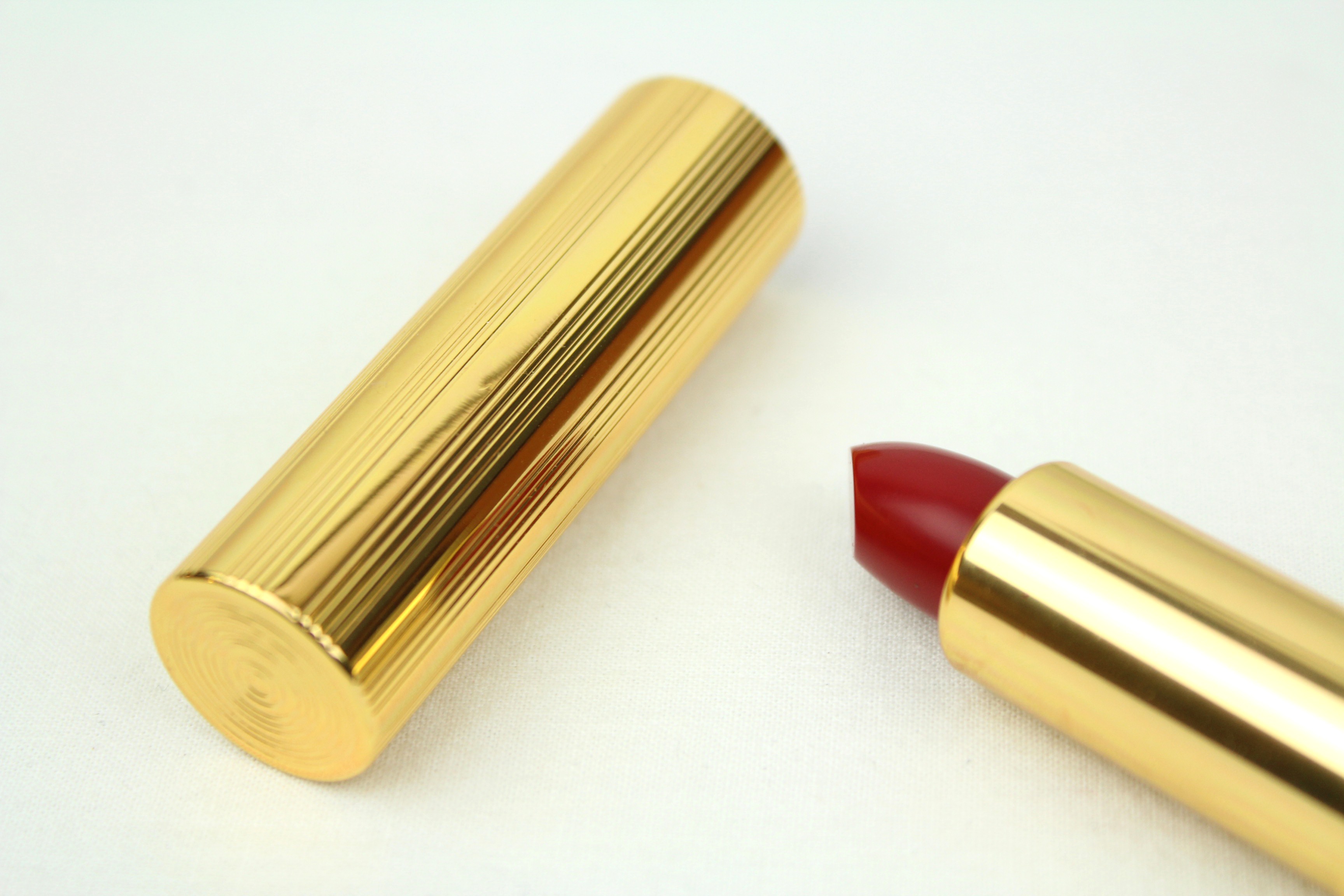
One of my favorite side-effects of the resurgence of vintage and retro aesthetics is the old school packaging popping up here and there. If lipstick is good, lipstick in a weighty gold tube is better.

A great example is this Albeit lipstick I mentioned briefly before (wearing here). Estée Lauder’s Mad Men collection has the same vintage look, as does Charlotte Tilbury’s new line. What can I say? I like the color gold. I agree that one can have too much of it and that it is sometimes tacky beyond redemption…but there it is. I want it. And it’s festive in the bargain.

A great formula is key, of course, but packaging is part of the experience. Even if the act of using the product is private, as I think is more often the case for our generation (fading is the image of the woman pulling out a compact to touch up in public), still each element adds its weight to the whole, marking the difference between the perfunctory and the ceremonial. Naturally it feels special to use objects we find beautiful, and their beauty helps us to be mindful of our task. More appreciative, maybe. If we have chosen truly to our taste. It is the case for me, when I choose truly to my taste.

Elizabeth Arden, Estée Lauder and YSL have always understood this. Michael Kors had the right idea from the start with his new collection (we agree about the supremacy of gold, Michael and I). Props to biodynamic brand Dr. Hauschka for their satisfyingly luxe packaging, and it’s not as metallic but I quite like Clarins’ packaging, too.  Once in a while Revlon releases one of their retro pigments in vintage packaging and I keep waiting to run into one. Certain designer brands, too, do limited edition packaging once in a while that I think really lovely (think Givenchy, think Armani). Tom Ford, though he doesn’t go full-on with the gold, has that Midas air about him, everything he has a hand in glinting in the light.

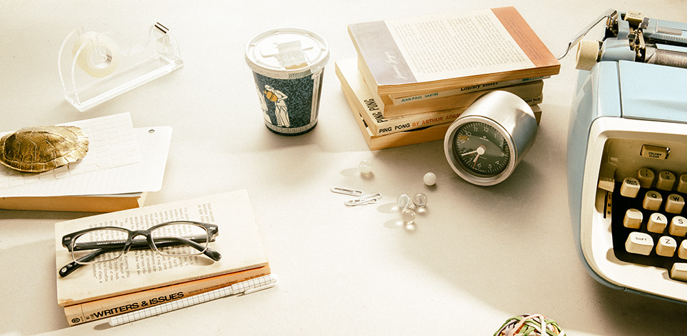
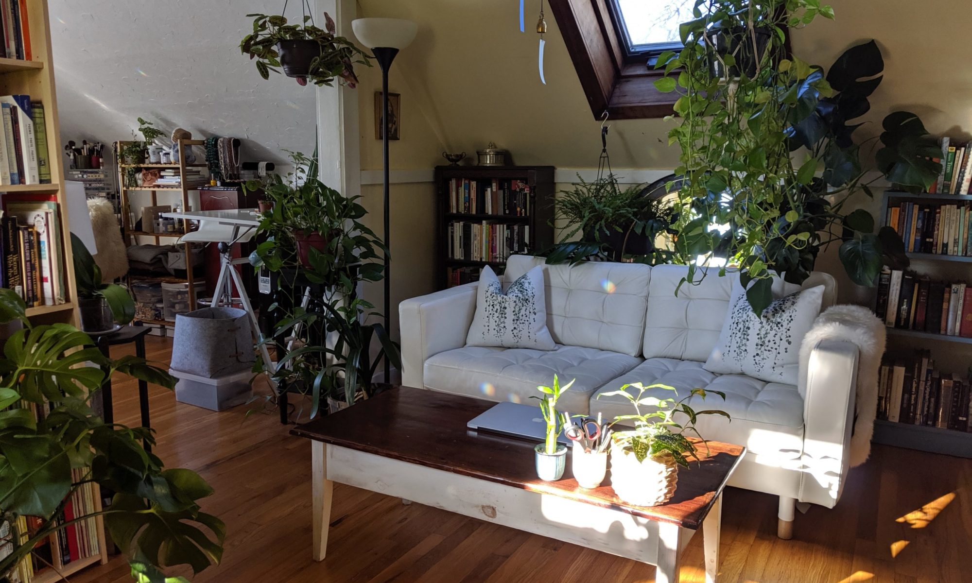
I find value in that sensation of using something special. Often I wouldn’t think of these objects as especially important to me or tangled in sentiment (if so it is a sentiment that begins and ends in their aesthetic appeal), rather as influential when directly in use. I think I take it to something of an extreme, and want every object in my little empire of possessions to feel special, purposeful, chosen. Really a lot of them do, though. A lot of them are. It is perhaps not too unrealistic a desire.

the Warby Parker fall 2013 collection: a literary homage

WP_FALL2013_still_2This post is not sponsored. All opinions are my own, etc.

Remember how I mentioned really liking Warby Parker?

Chic, affordable frames, cool progressive vision*, and for every pair purchased a pair is distributed to someone in need? Remember?

*ex. the origin of their name: “We’ve always been inspired by the master wordsmith and pop culture icon, Mr. Jack Kerouac. Two of his earliest characters, recently uncovered in his personal journals, bore the names Zagg Parker and Warby Pepper. We took the best from each and made it our name.” They are basically out-hipstering the hipsters.

Well, it turns out that their fall 2013 collection, launching today, is a “reverent bow” to literary figures of the early sixties; Ripley (The Talented?), Holcomb (I’m guessing Roscoe (cf. Man of Constant Sorrow, check out his glasses)), Ellison (Ralph)… I love the combination of fashion and literature, though I’m not clear on the exact reference with all of these. Sad, isn’t it? Admittedly I’m not really up on my sixties literature, the 19th century being more my style. I do like Patricia Highsmith…

Warby Parker offered me a chance to have an early look at the designs and participate in the launch along with other bloggers who will be weighing in on the collection today, a neat grassroots marketing approach. Honestly I don’t need glasses** (yet) but I am coveting some of these anyway.

**I sometimes wear them regardless, with non-prescription lenses. I do what I want.

I like how this collection has balanced being heavily stylistic and retro–some recall famous black and white photographs of their referents immediately to mind (you know, if you know what they are), and to wear them is to carry those echoes with you–with being entirely wearable. They’re not, at least to me, over the top. They remain accessories consistent with current styles and don’t tip over into the realm of costume (well, maybe a few options come close, but still), as we see with some retro-inspired fashion. They are eccentric (statement pieces) without ever losing a sense of style – not only personal style (all eccentricity has that, which I fully, fully support) but style with a finger on the pulse of the best of current trends. I can see these appealing across the board to a wide variety of aesthetics (the pinup, the executive, the entrepreneur, the academic, the writer (of course), the fashionista, the flaneur…) independent of age and gender.

All this without being too on trend (well, depending on the rest of the look), which can create an effect of self-consciousness, of trying too hard, wiping out the appeal of being stylish (in that current sense) at all. One wants to express a personal interpretation of a style, not be a parody of one (unless one does happen to want to be a parody, in which case fair enough). You don’t want the style wearing you.

That these are quiet interpretations (the dark palette rather than rainbow options, the softness of browns and grays rather than a hard black rim) of the sixties styles they are referencing keeps them modern for me, and the warm brown tortoiseshell options are spot on for autumn. You can see the full collection and details on their site (eyeglasses / sunglasses) so I’ll just point out a few of my favorite styles and color options.


ripley-optical-oak-barrel-front

 Ripley in Oak Barrel

duckworth-optical-oak-barrel-frontDuckworth in Oak Barrel

This shape is somehow just what I hope it would be.

holcomb-optical-marbled-sandstone-frontHolcomb in Marble Sandstone

The Marble Sandstone options are the loudest, I would say, and flirting more with that costume/eccentricity line than the rest. Still great, though. I like the darker version of this style, too.

ellison-sun-whiskey-tortoise-frontEllison in Whiskey Tortoise

rowan-optical-whiskey-tortoise-frontRowan in Whiskey Tortoise

My favorite frame has to be the Duckworth, I think, with the Ripley a close second, but it’s a tough call. I’d be curious to try all of these on. You really never know until you see them on.

In sum: I like a brand that can tell a story. (They’ve made a commercial for the collection, too.)

WP_FALL2013_still_1Images provided by Warby Parker.