the dreamer

IMG_9383

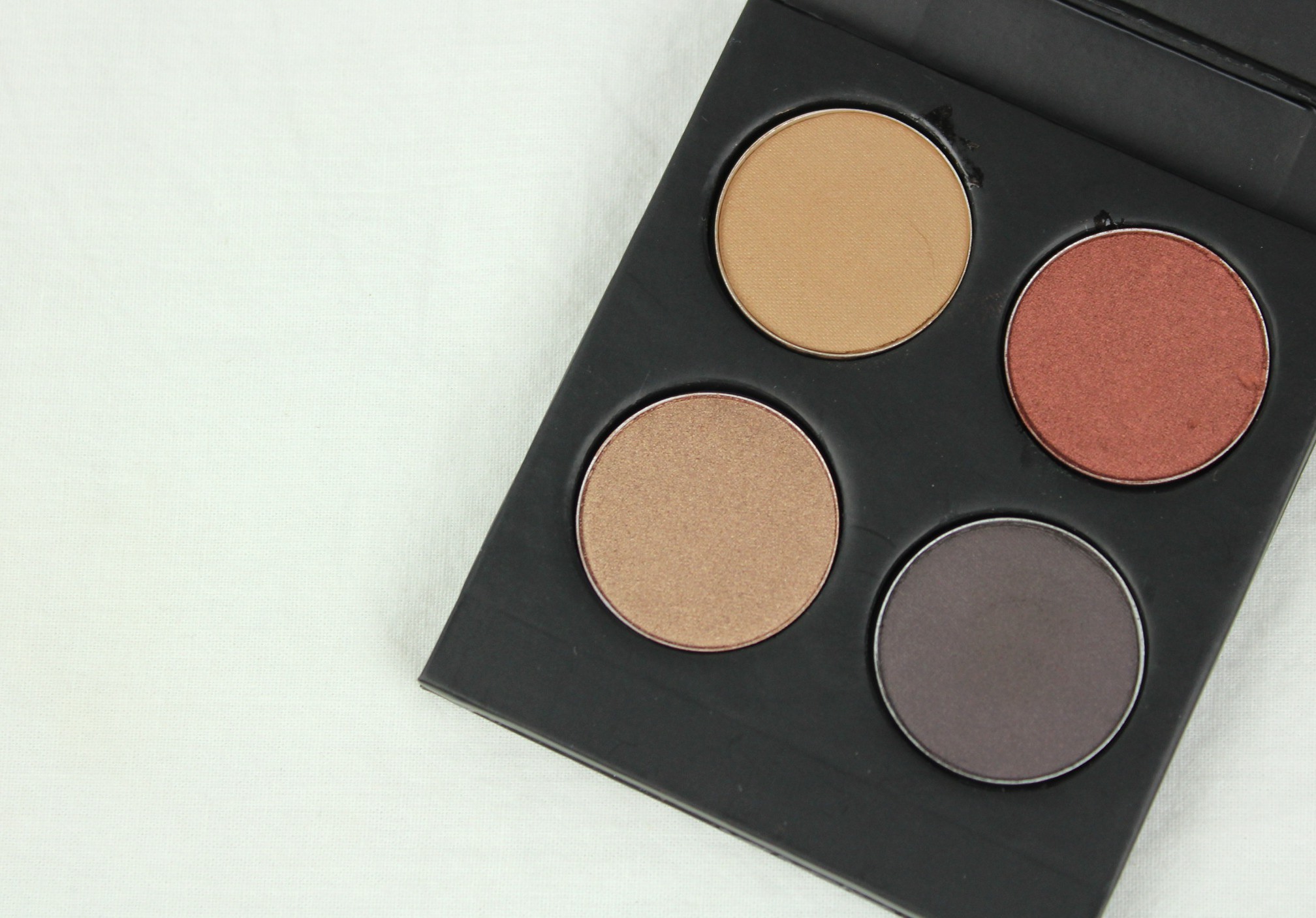
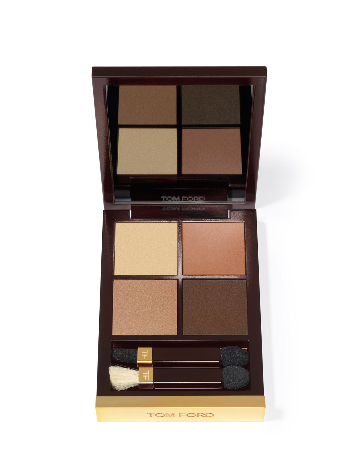
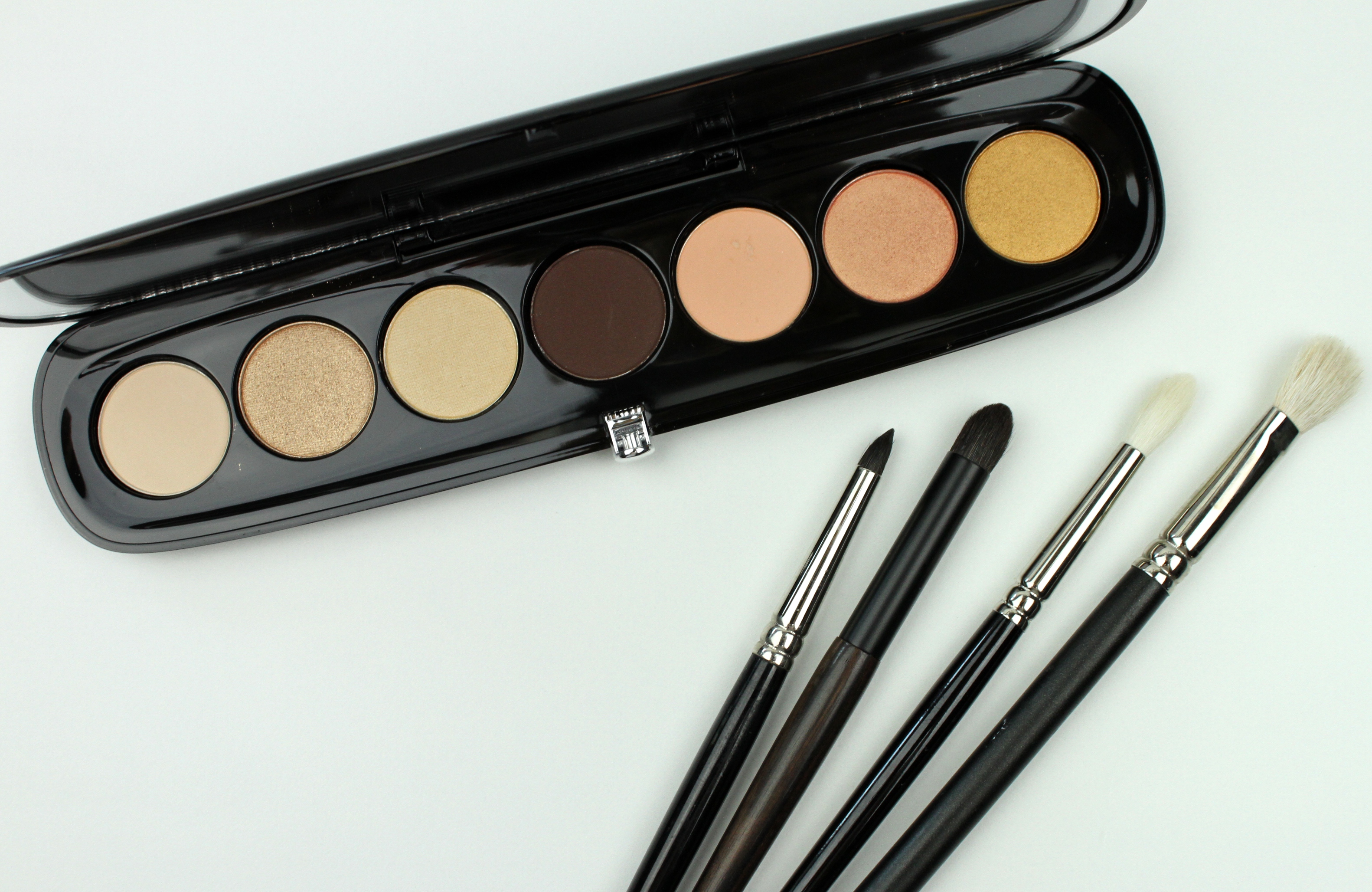
Marc Jacobs Beauty palette The Dreamer, brushes: Hakuhodo B5520BkSL, H2289, J146, MAC 217

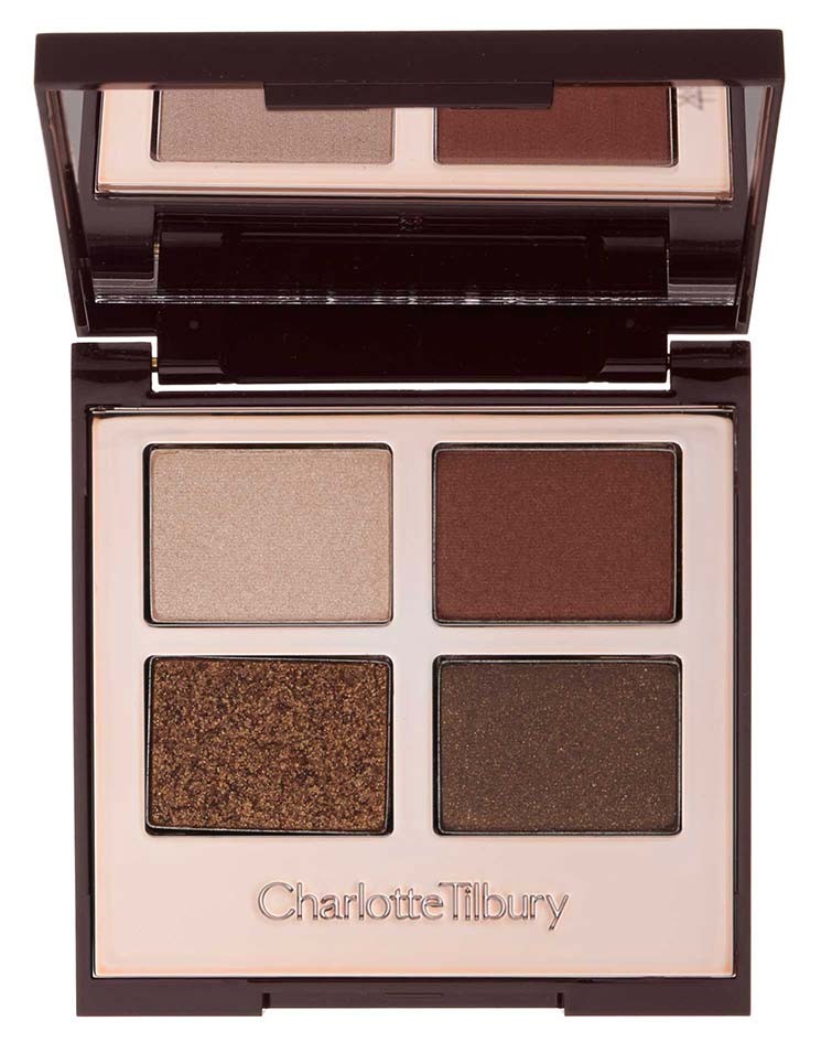
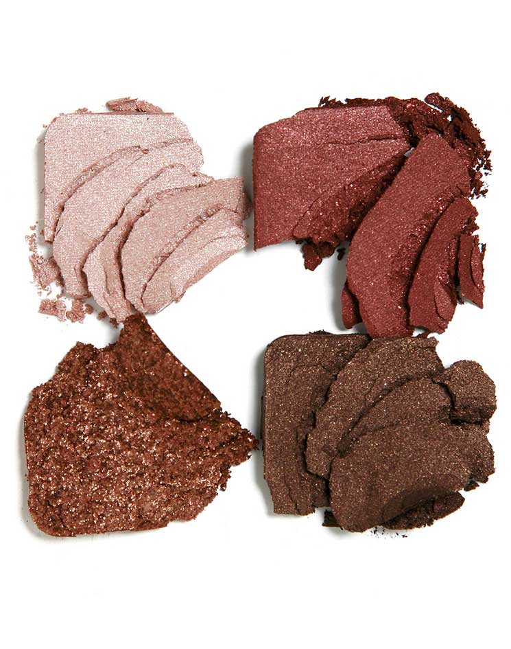
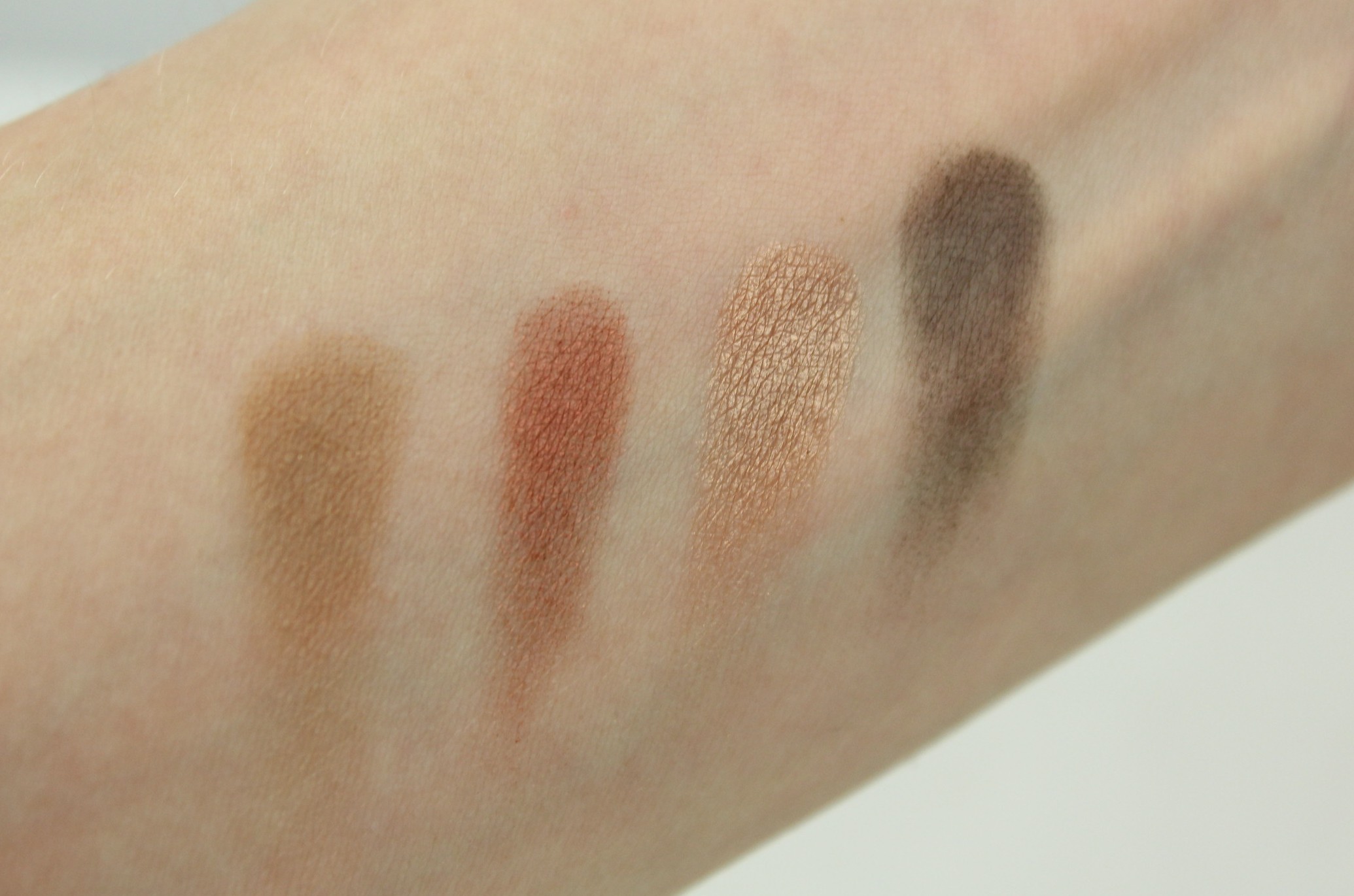
This stunner of a palette from the Marc Jacobs Beauty Style Eye-Con line is one of my new favorite beauty toys. This is The Dreamer, essentially the neutral palette in the collection. I’ve spoken before about the siren-like allure certain color combinations can have, the power of a palette. I might not be interested in the colors individually, not enough to buy them, but combined I am drawn closer and closer to the jewel box. This one I found completely compelling from the start, and especially so once I saw it in person. I wandered into Sephora intending to look at the Night Owl palette from this same collection but it was out of stock and I met this one instead (actually I’m not uninterested in the Night Owl palette, it’s been noted). The golden goddess that occasionally runs the show here gave her immediate approval. Gold, champagne, a pale grapefruit, deep walnut, and warm neutrals… really I didn’t stand a chance against these colors.

IMG_9386

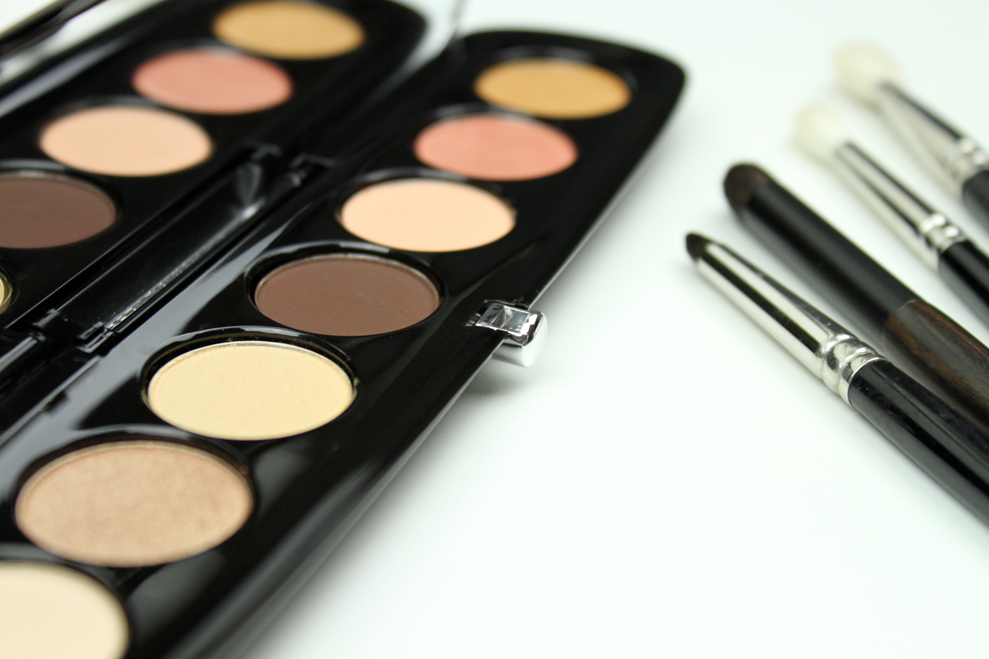
These shadows are what others have promised, they are so creamy as to have veered as far away from the realm of powder as possible without quite leaving it entirely. Sleek packaging. I’m pleased with this line—so anticipated—all around. I don’t like every design from Marc Jacobs by any means but I have admired him for many years now (over 10 years, I realize, since I began following him! After a friend in college with impeccable style noted him a favorite), the clarity of his style, the bold strokes and adventurous lines.

This is a bit too expensive, though, I think. $59 for this palette, and the shadows are not large. So, it is beautiful, but I would not exactly recommend it, at least not over many other excellent neutral palettes at more reasonable prices. But, it is beautiful. The quality is there. Priced similarly to luxury brands like Dior, Chanel, Guerlain, etc. If you are up for it, I think the money is not badly spent. And I don’t already have the ubiquitous Naked Palette, so I justified this effortlessly. I picked up some Hakuhodo brushes a few months ago as well, and liking. Will get into those later.

The lure of this palette made me realize how predictable I am in such cases. Chuck certain colors together and I’m sure to take a second look. Why? Why is this? Why these colors? Golds, caramels, creams…but others, too, which is why, for different but equally compelling reasons, I am drawn to the Night Owl palette as well.

Though, I suppose, why anything? Why do I like Brussels sprouts and ginger so much? Why the smell of vetiver?

Who can say. It seems one might be able to know, if only the data were accessible…but probably this is an illusion.

What are your colors?

x

the custom palette

While I have a lot of eyeshadow, I am still tempted by palettes (sometimes, once in a while), which have the timeless appeal of compelling, immediate* shade combinations. I wonder if I even care that they are eyeshadow, in a way. I suspect part of the temptation is the pure visual pleasure of certain shade combinations, a harmonious whole greater than the sum of its parts.

*The convenience and mobility of multiple shades built to work together in one small compact is meant to be a big mark for the pro column but eyeshadow isn’t one of those things I tend to carry around anyway, and I do not allow myself to use this as a personal selling point.

Usually, though, I really cannot justify acquiring them, as in the case of two that have been calling to me quietly, stubbornly, for the last year or more.

Charlotte Tilbury Dolce Vita

pp-quad_the-dolce-vita_1pp-quad_the-dolce-vita-crum_1

vendor images

This is about $65, which I could almost stretch to—so glowing are the reviews, so gorgeous are the colors, so unflagging is my interest—but Charlotte Tilbury’s line, relatively new, doesn’t yet ship to the US and can only be had through Selfridges, the luxe British department store now of Masterpiece fame (I find Jeremy Piven awful in it, incidentally). They will deign to ship to the US for about $50, which I just cannot see my way to paying.

I like the combination of colors so well here, though, the saturated russett, the shimmering bronze, the warm champagne, the rich earthy brown…I decided to approximate it myself, with a bit of poetic license. I found this little 4 pan, no-fuss Japonesque compact, and chose some individual shadows to populate it. And (perhaps the best part) gave it a name.

IMG_3142

Courtesy of a Sharpie gold metallic paint pen. I knew I’d need that one day.

IMG_3145

The Minx. L to R: MAC Soba, MAC Antiqued, MAC Woodwinked, MAC Smut

IMG_3150

The compact was something like $8 (with promo code, always with promo code), and it was around $10 for each shadow here (less for a few I found a deal on). I’m going to value this at around $45. It could have been less if I’d opted for shadows from SMH or Makeup Geek, say, around $6 each, and with pretty good reviews (though worthwhile to get reviews on individual colors under consideration, as quality is not consistent across a range – this goes for any brand, really).

Tom Ford Golden MinkNMC0Z2P_mz

vendor image

Stunning, but $78 at the moment, plus tax, and I just can’t quite approve it in the budget: an impeccable warm neutral palette with one of the best formulas on the market, buttery smooth pigmentation, unparalleled blendability….and no. I cannot buy this now.

So I bought these, in the Golden Mink spirit:
IMG_3154

IMG_3156

The Golden Age. L to R: MAC Nanogold, MAC Tempting, MAC Era, SMH Taz

IMG_3160

This one could use some fiddling, I think. The first color a bit too pale? A work in progress.

For about $38? Something like that. Not exactly cheap, but acceptable (approve-able, do-able) to me in a way that $78 is not (for now…). It’s only a loose translation but one I like a lot, so what does it matter the point of departure?

One appealing aspect of these palettes is that I could switch any of the colors out for others (I have several shades in the bronze/gold/burgundy range, and any number of successful combinations might be made, a fun color exercise). I also could have gone to an INGLOT counter to do this for around the same price, which I was tempted to do, and which I reserve the right to do at some point in the future.

There’s an undeniable appeal to this kind of customization, and it’s no surprise that the consumer industry is leaning more and more toward incorporating the hand of the customer. You entirely sidestep that unfortunate scenario in which you pay for a palette but only intend to use some fraction of the colors, tolerating the duds and writing them off in the cost-benefit analysis. Basing your selection, even if loosely, on an existing palette you admire, is a way to capitalize on the knowhow that went into the color selection while injecting a bit of your own style; these colors are going to work, and they’re going to work especially well for you.