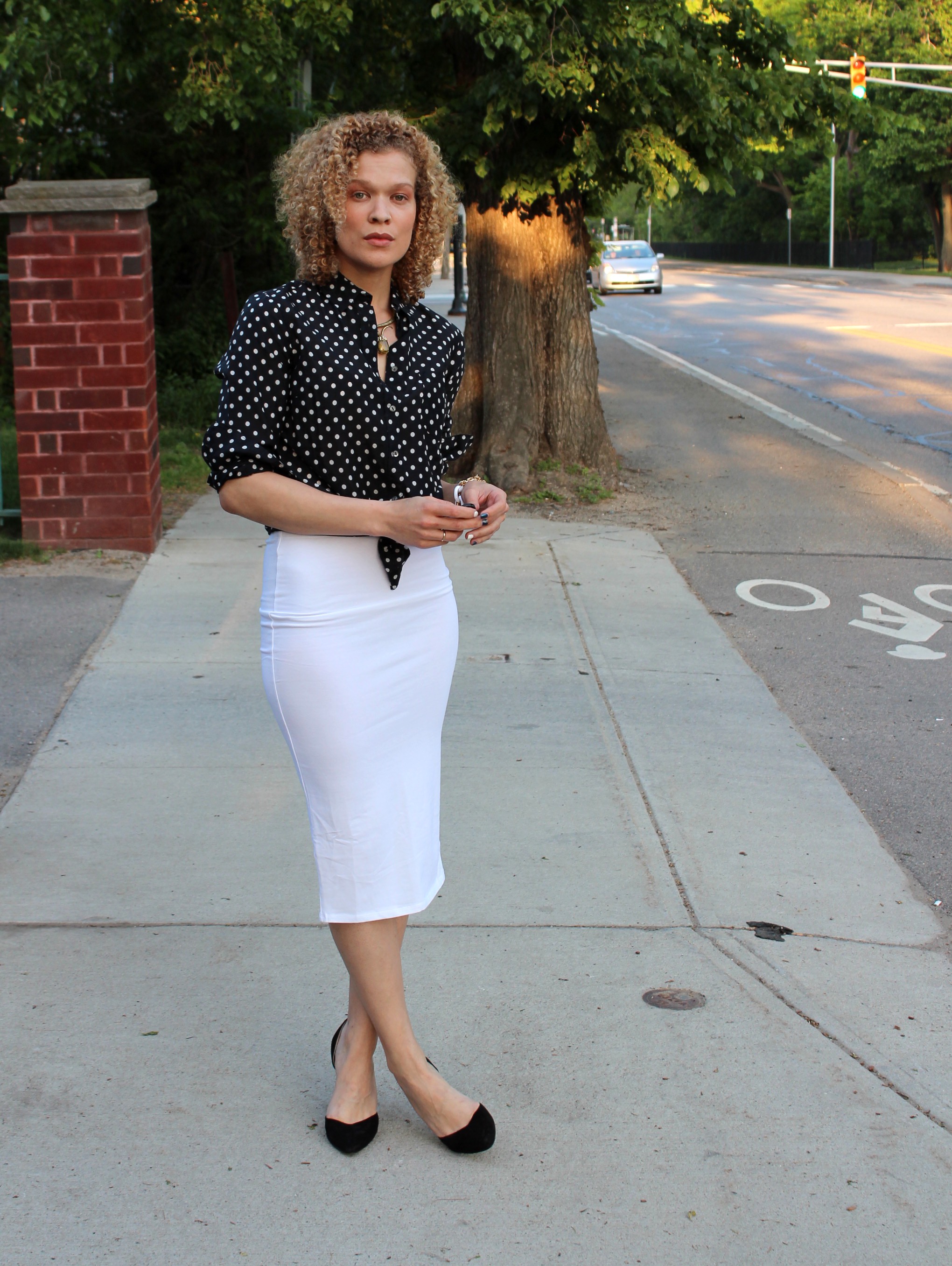
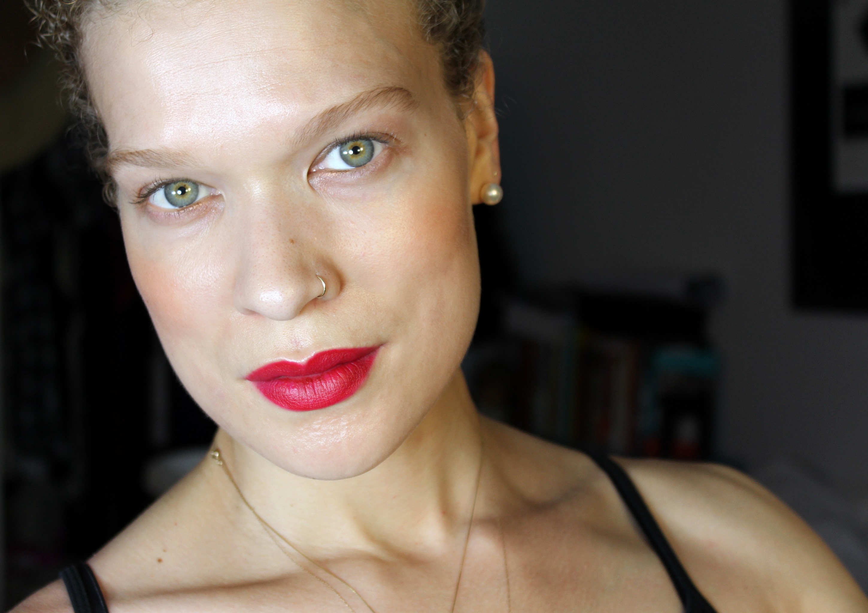
I’ve been in the mood for pinks lately, of all shapes and sizes, as it were. Blue-pinks and coral pinks, vibrant and restrained, nude and bubblegum, sheer and full-on. In Dolce and Gabbana Beauty’s matte lipstick range I found this deep rose shade, Dolce Lover, and was immediately attracted.
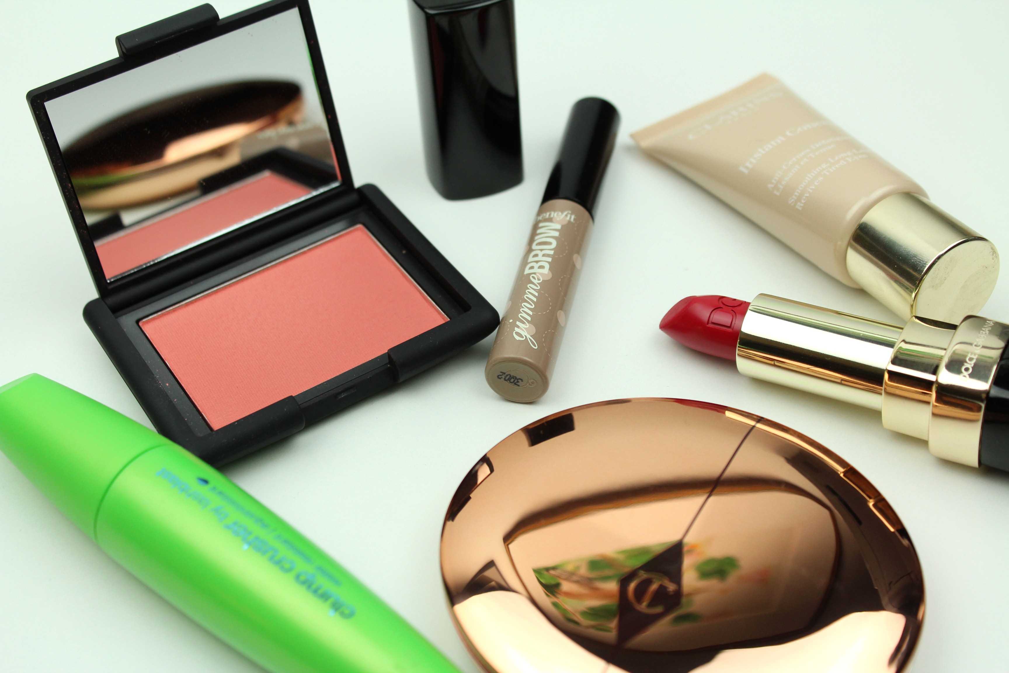
CoverGirl Clump Crusher mascara, NARS blush in Gilda, Benefit Gimme Brow (light), Clarins instant concealer (2), Charlotte Tilbury powder (2), Dolce & Gabbana beauty matte lipstick in 624 Dolce Lover
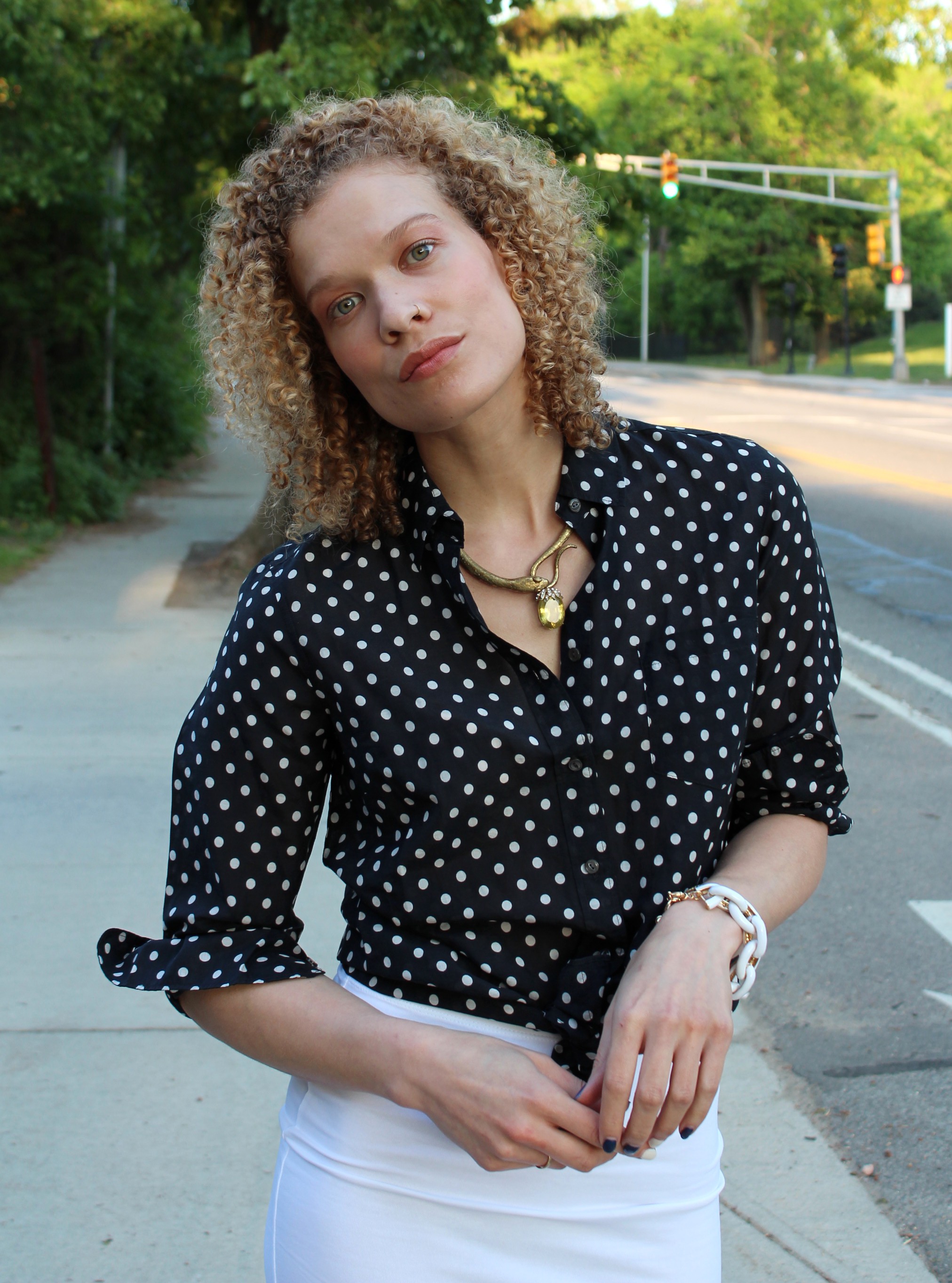
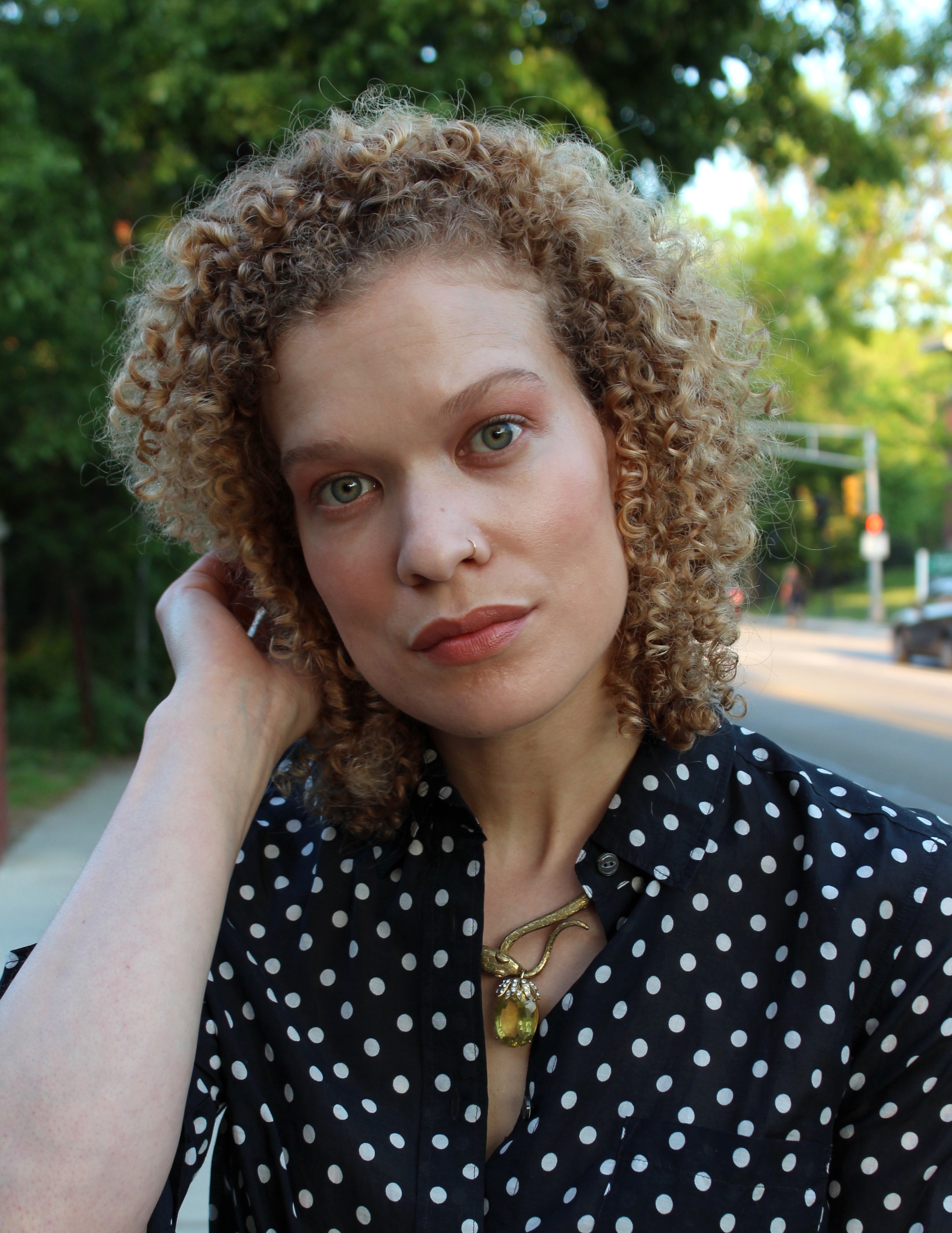
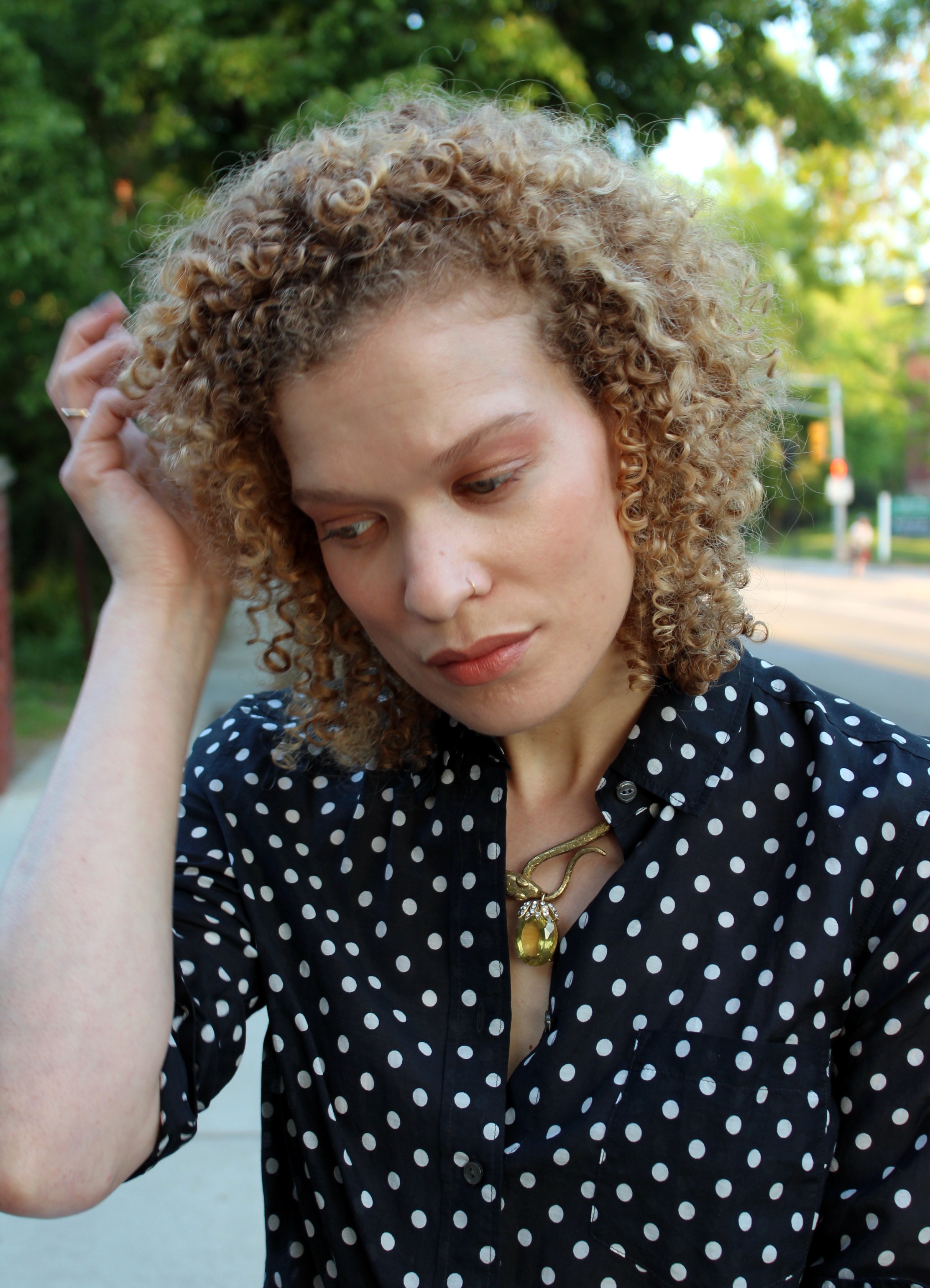
Depending on the light, this lipstick looks on the verge of red in the tube, and on the lips as well for that matter. It is, though, a deep, vivid rose. This is an incredibly pretty color, and a great matte formula. I put this up with Charlotte Tilbury’s matte lipsticks, maybe Tom Ford’s as well. Creamy and not at all drying, that kind of incomprehensible formula that does kiss off on things, on account of the creaminess, but that, somehow, bizarrely, is always still on your lips. A beautiful formula.
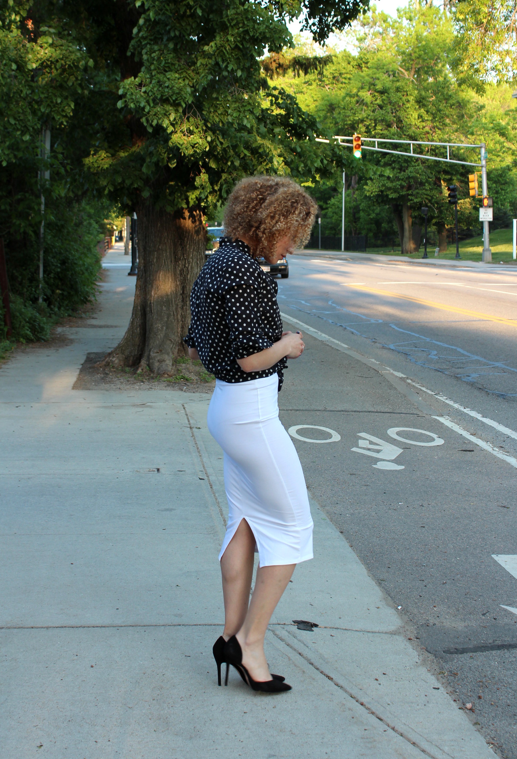
I’m also wearing (in addition to the pile above) the it Cosmetics lip pencil in Cherry Plush and a little Guerlain Terracotta bronzer. Oh, and the Glossier sheer tint. A really clean face with a bold lip, which I always like.
I’ll have to try to go into the universe of red as it exists for me sometime, especially as embodied by lipsticks and other lipstuffs. I make so many distinctions between shades, often—even after discovering so many wonderful shades—on the hunt for something….something a little different. Something I can’t quite put my finger on. The color of this tomato or that flower. This pink, hovering on the boundary between pink and red, has a vibrancy that some reds, however, glam, sometimes lack for me. It’s matte but not in way that cancels out light like some black hole on your face. It responds to light. There’s also the charm of it being more truly opposite my eye color on the color wheel. Red is opposite green in a basic crayon sense of those colors, but pale sage green is opposite something more like fuchsia, dark pink. Messing around with a color wheel is a great exercise when testing out complimentary shades for oneself, always keeping in mind that it should be completely ignored in many, many circumstances. And maybe also keeping in mind that really any shade on the opposite hemisphere (not just directly or even narrowly opposite) will have a similar effect of throwing your target shade into relief. [Ex. A peachy cheek makes the green pop, too, or the green makes the cheek pop. Either way.]
Then we have the unlikely pairing with NARS Gilda blush, a rusty pink (or we could call it a blushing apricot, cactus flower) that isn’t much talked about for reasons unknown, so lovely is it. [Similar to NARS Luster but more pink.] It’s recommended, for good reason, to keep lipstick and blush in the same color family, it gives harmony and unity to the face (I sometimes just use the lipstick as a cream blush). A warm blush paired with a cool lip is jarring, distracting…but who is to say this is inferior to harmony? Somehow the distracting quality comes across more in photos than in person, in person it seemed less remarkable a clash. Actually this would be better if the clash were more dramatic, I think.
Ah well.
Next time.
Maybe when I get around to showing you the little mountain of pink lipsticks I’ve picked up recently.
x