please me

My initial lipstick acquisition phases centered around reds and oranges, then deep red wine shades, so, for someone who has a lot of lipstick, pink is relatively underrepresented. Or, it was.

We’ve done some catching up, pink and I.

One of the most recommended shades was MAC Please Me, a matte mid-tone rose pink. This is right on the border of being too pale for me, that region of the spectrum of yellow-based pink that makes me look ill/green, from which I have to go either brighter (toward neon) or darker to find a shade that doesn’t jar.

It’s surely partly a mental block of my own as well, I concede. I don’t wear pale pinks, so I always think they look off. That said, paired with a slightly darker liner (this lipstick is better with a liner, anyway, not opaque enough on its own), I can totally work with this.

mac please me lipstick

Look who put on eyeliner! That’s Bobbi Brown gel liner.

I’m willing to experiment to push the boundaries of how pale I can go before things get weird. Ideally I will at the same time shift those boundaries, expanding the realm of color open to me. [Of course the entire realm of color is open to me…but I am not open to it.]

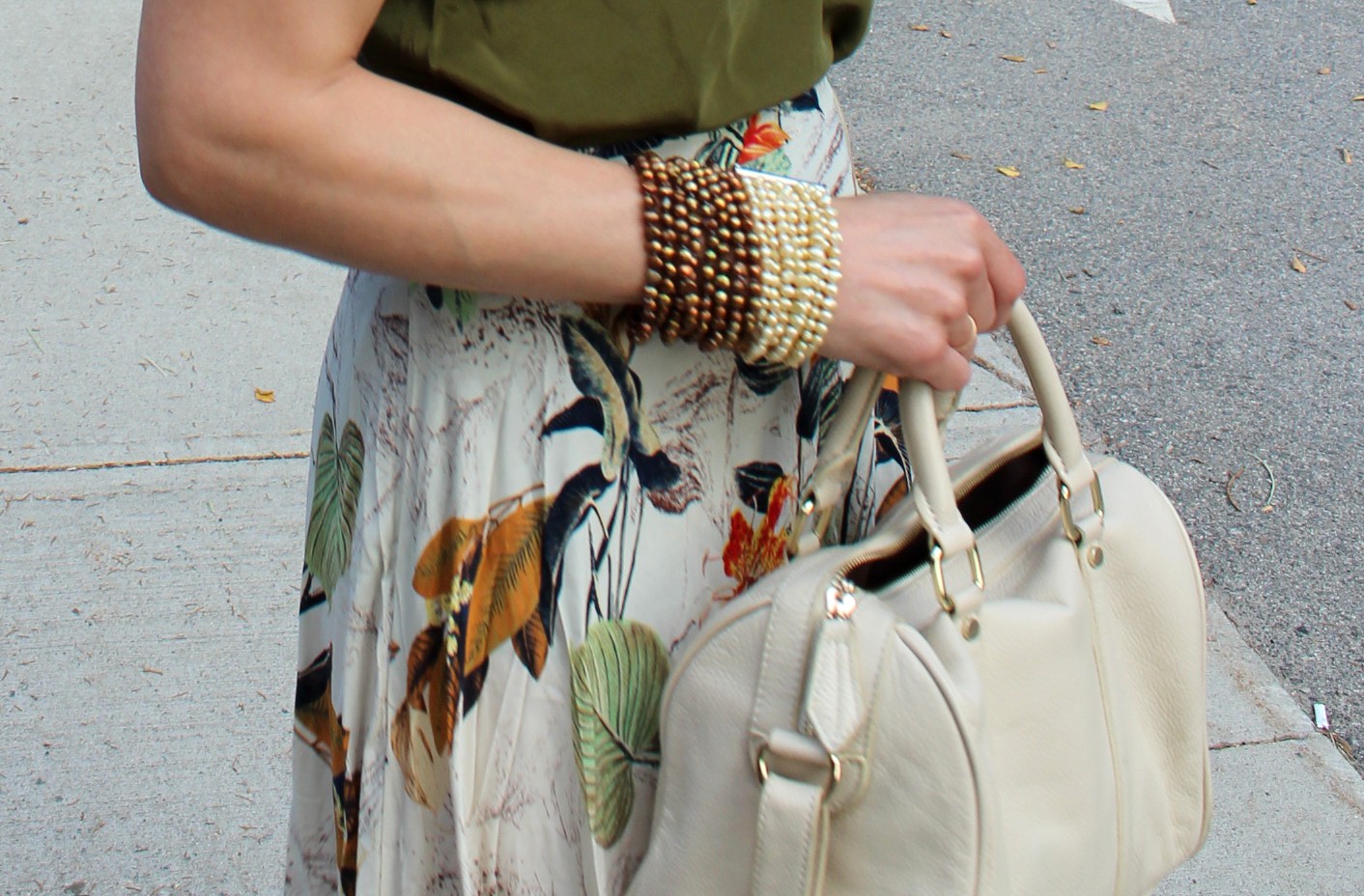
Rimmel Exaggerate lip liner in Pure with MAC Please Me in the center, Koh Gen Do Aqua Foundation (still loving) with Rouge Bunny Rouge Impalpable Finishing Powder (also really like, though I’m going back and forth between that and the Charlotte Tilbury pressed powder, with is fantastic). Chanel Cream Blush in Affinite, which you can’t exactly see but which you would notice if it weren’t there. Played about with my Lorac Pro palette, even! Eyeshadow! And the brow perfection going on is MAC Pro Longwear Brow Set in Bold Brunette, pretty emphatically not my shade, several shades darker than my real brow color, but just the thing when I want to get the brows really dark but still natural. Officially I prefer Benefit Gimme Brow in Light/Medium for going just a teeny bit darker and grooming into place.

Barry M Nail Jelly in Satsuma.

x


summer tropics

Far more likely to engage my attention than a floral print is a botanical print. Perhaps because they tend to be more lively, less repetitive? Because I love the color green? Because they often incorporate more earth tones?

It is likely all of these things, amplified by the volume afforded by the maxi length. What I really like about this print is that it conveys a tropical look without being garish or neon about it.

floral print olive summer skirt

I am particularly predictable about this kind of olive shade, grounded and earthy, and just inexplicably compelling, the way one’s favorite things often are. Can we take a moment for these sandals? Adore these sandals. Can we take another moment to embrace shamelessly rumpled silk?

henna italian leather sandals

Henna still going strong.

Ah, the maxi, so easy, so cool and loose, such a strong impact of color by virtue of square footage alone. I quite enjoy the gathering up and sweeping around required to go up stairs and such, too, and very much enjoy the billowing that accompanies descending the stairs. Yes, long skirts rarely look so well as when they are displayed upon a stair.

J Crew silk camisole Coach sunglasses

I also love this Cleopatra-style necklace, which I picked up at a Cambridge artisan co-op a couple of summers ago.  Always on the lookout for interesting, handmade pieces like this. I recently met the owner of local company December Thieves, which specializes in pieces from emerging artists in jewelry and fashion. She has wonderfully curly hair as well! Obviously we got along. She has the kind of shop that makes you want to take up metalsmithing.

pearls stacked bracelet

Kara Ross bracelet, amber ring

Especially like to pair amber with earth tones.

J Crew silk camisole, silk blend skirt (thrifted), Kara Ross bracelet, Gian Luca sandals, Coach sunglasses. On the lips, Chanel Rouge Allure Velvet in La Favorite (color showed better on instagram).


x