If you are attacked as regards your style, never reply; it is for your work alone to make answer.
— Voltaire, Voltaire’s Philosophical Dictionary. 1802
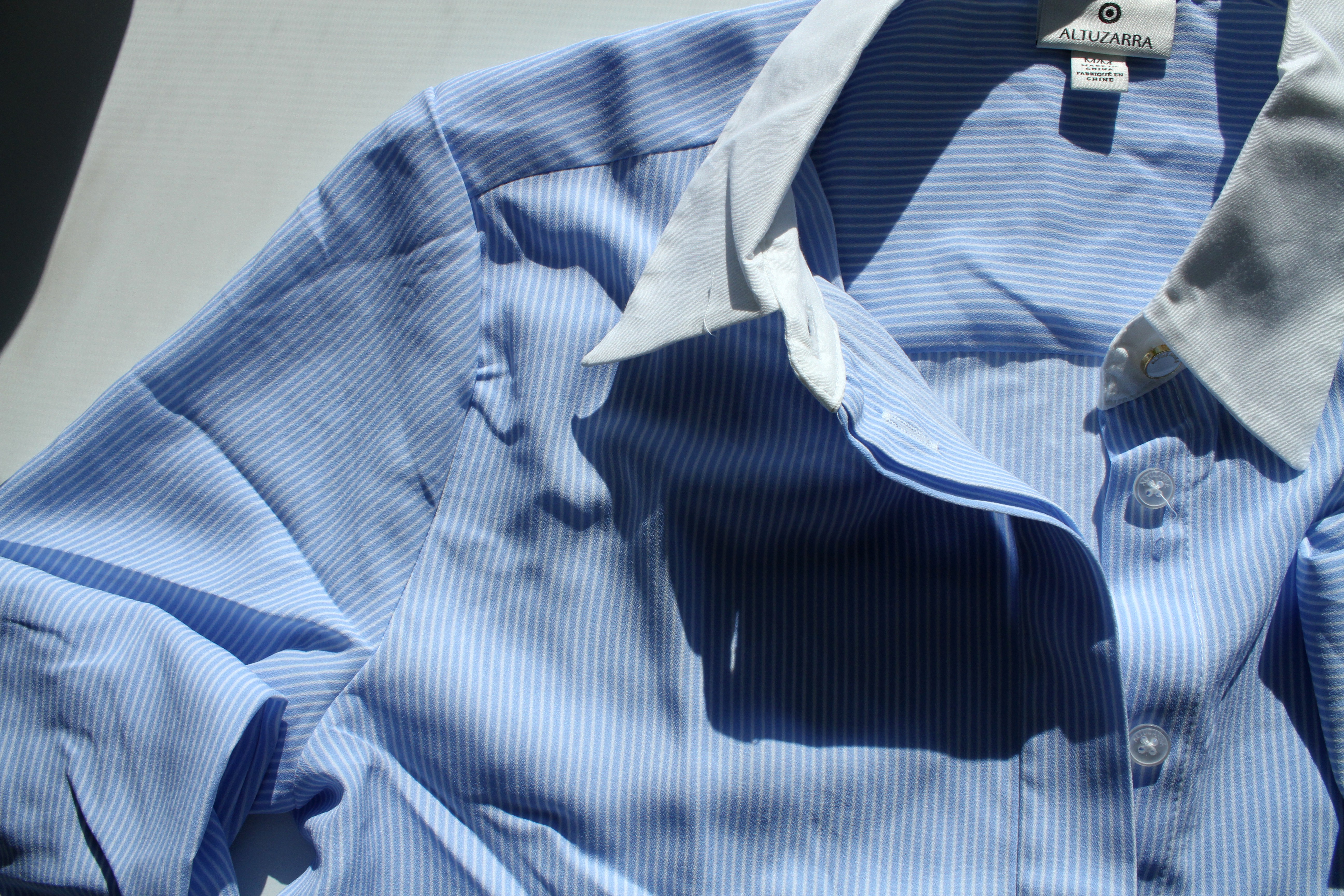
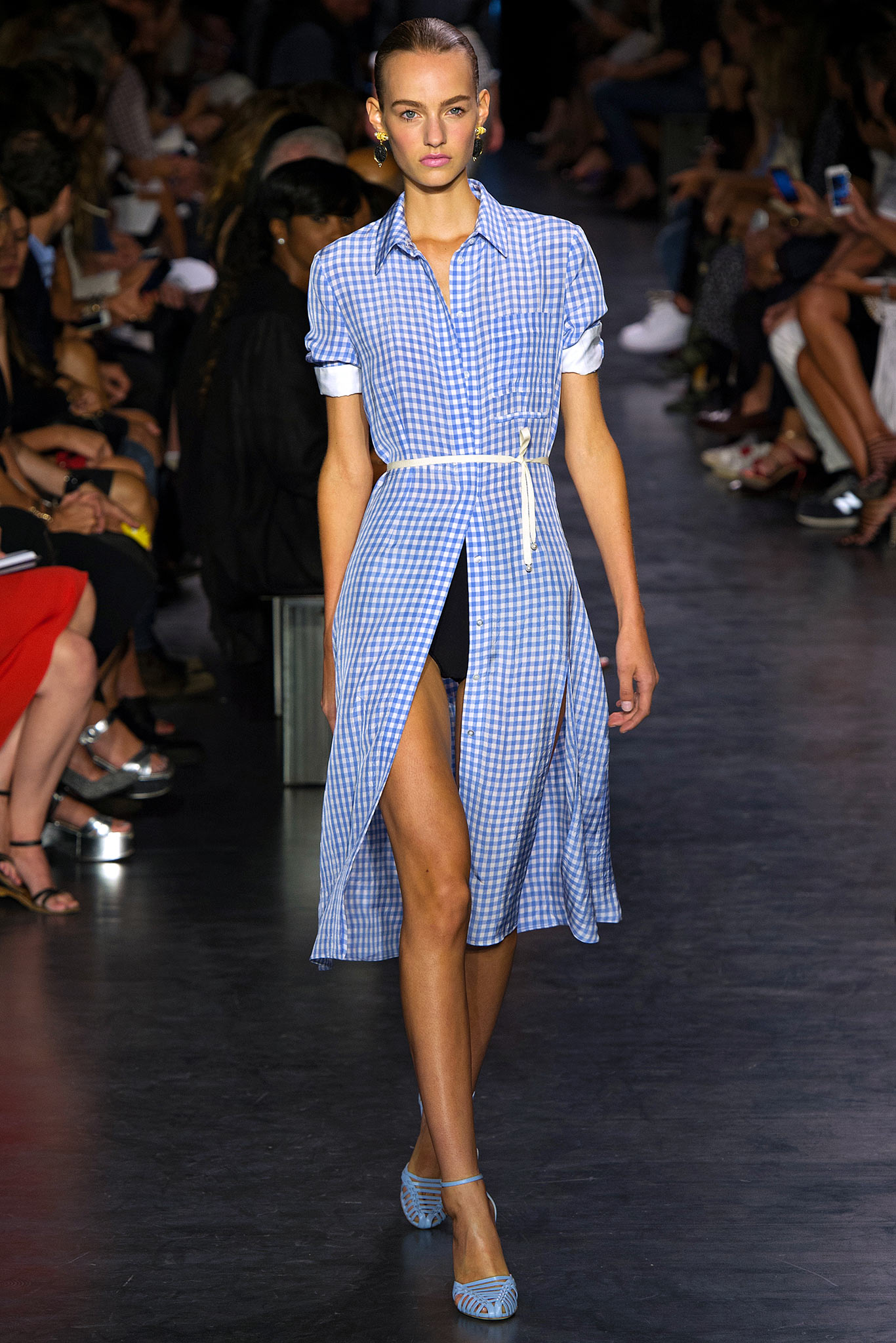
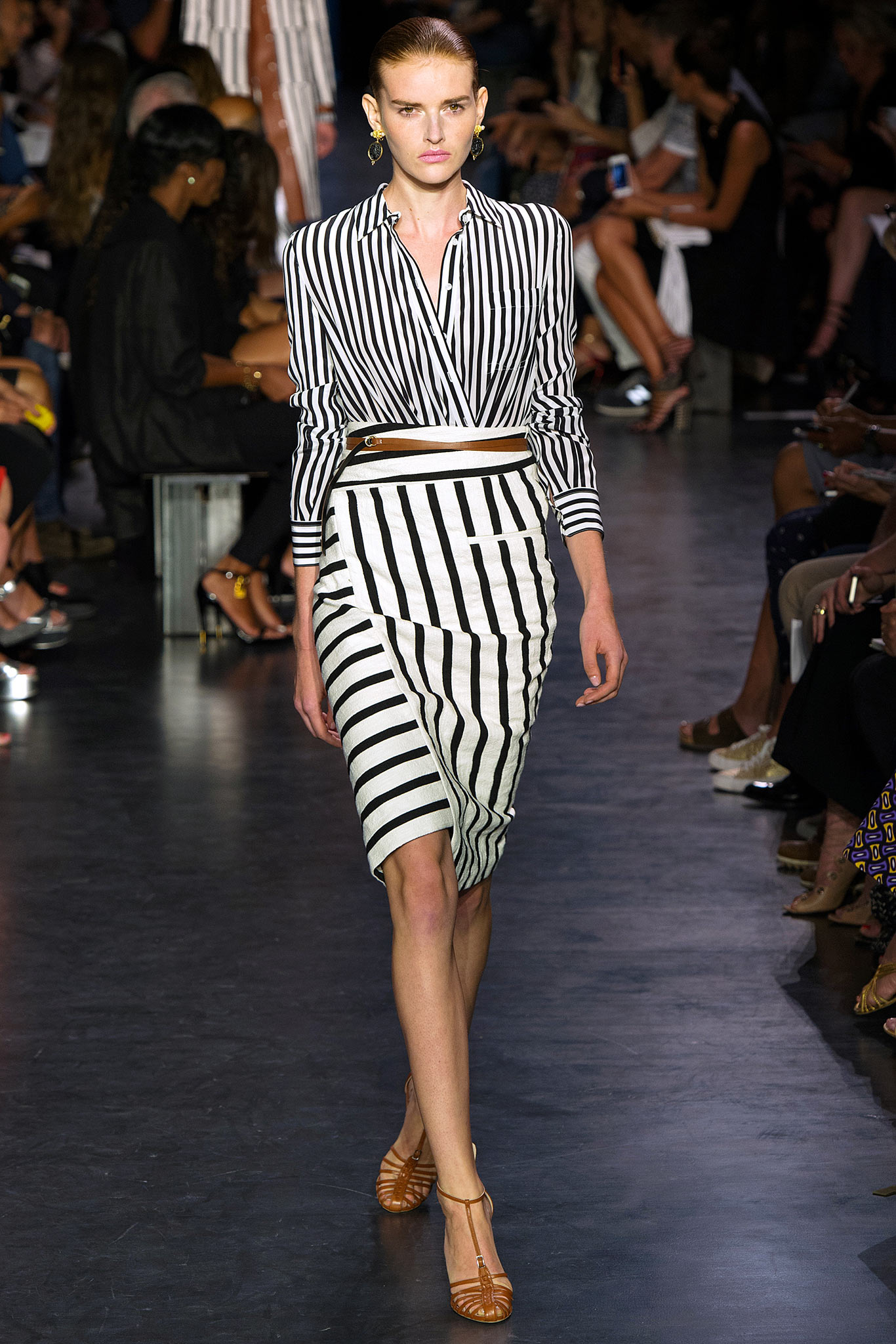
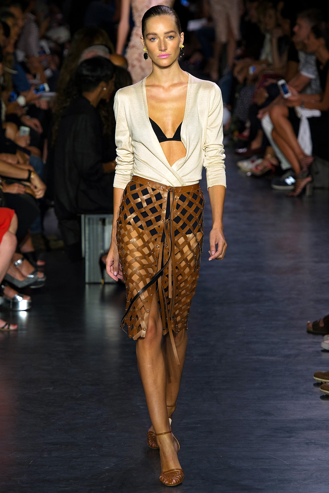
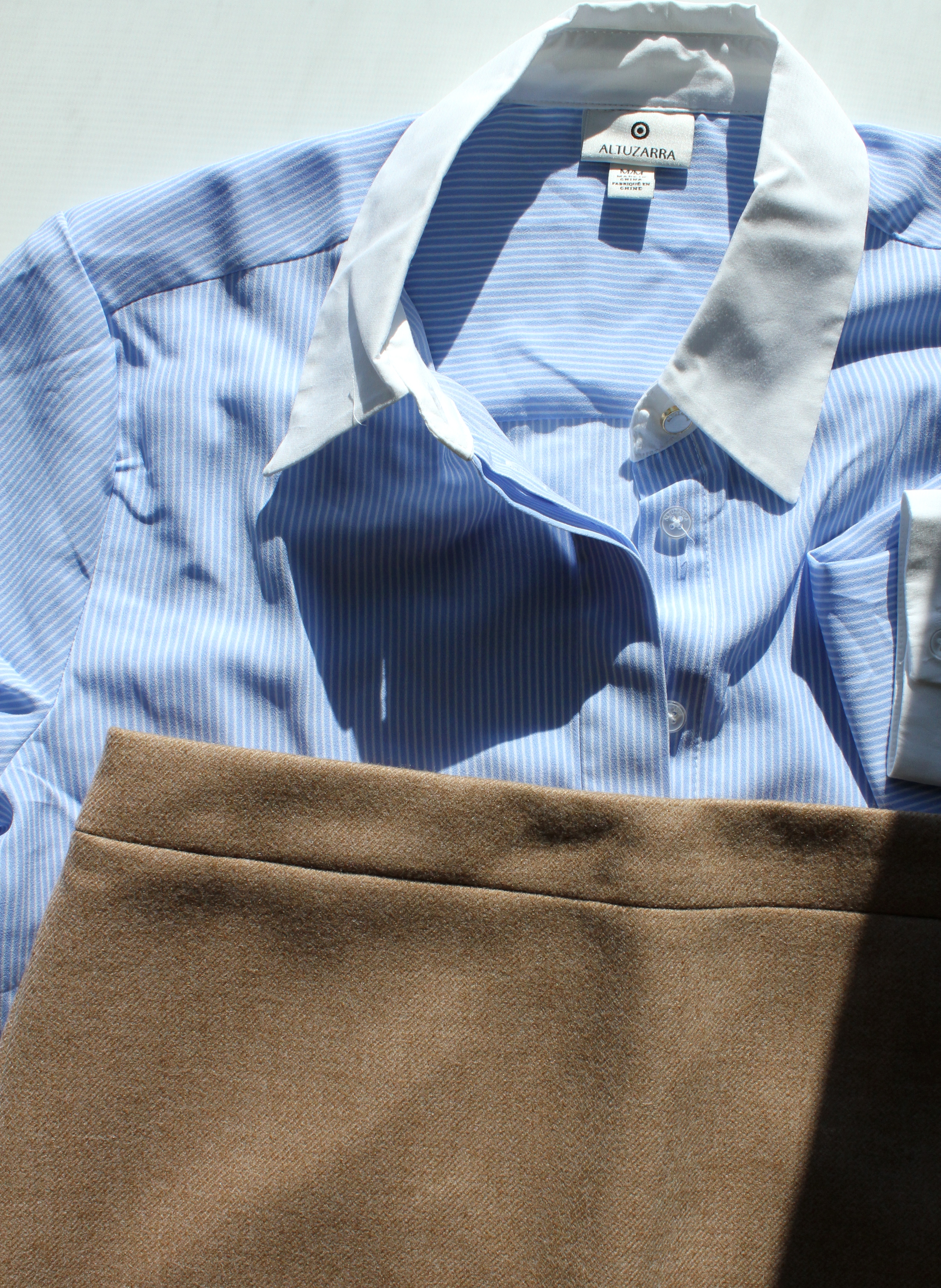
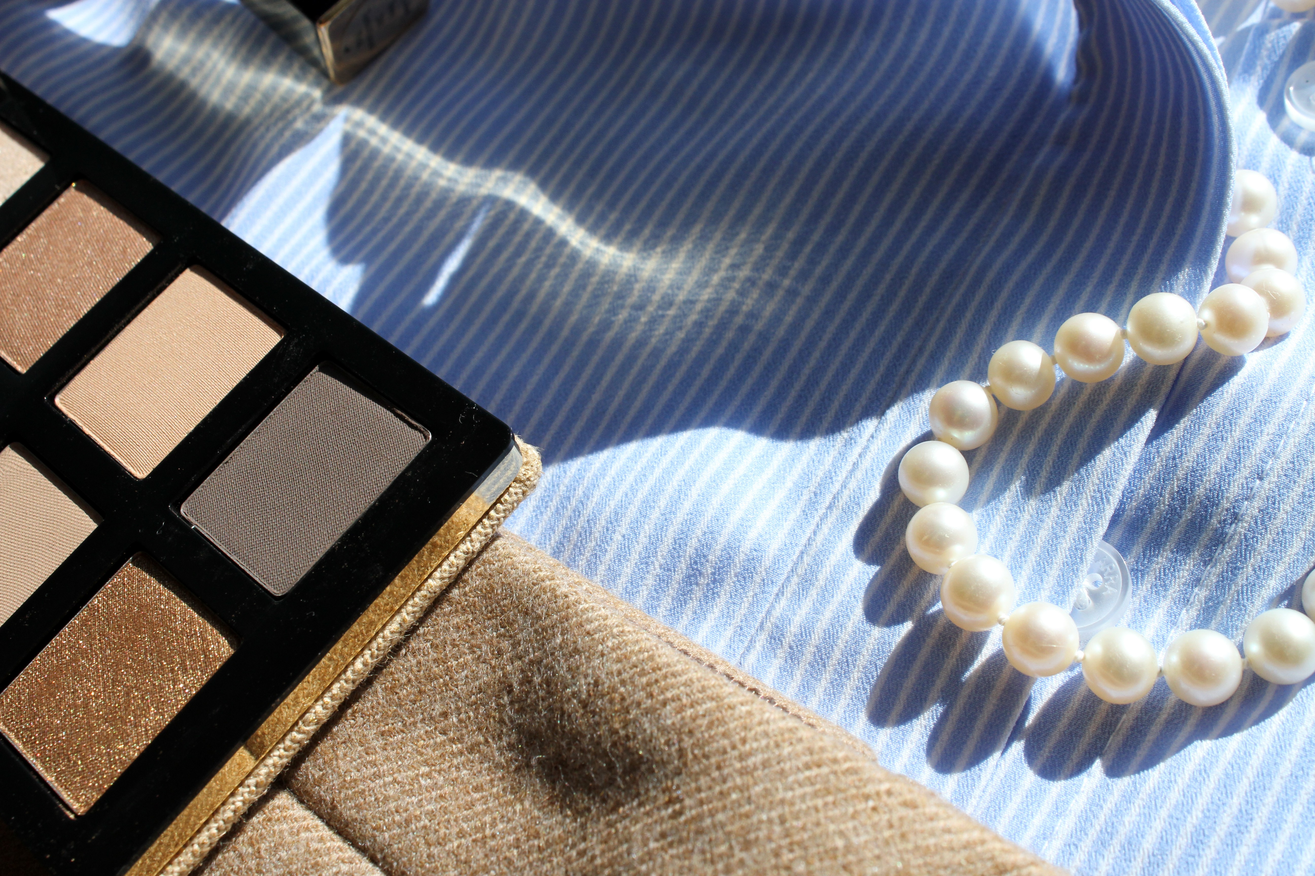
Here’s the shirt I picked up from the Altuzarra for Target collection (available on Net-a-Porter). Really nice cut, just an OK fabric, polyester crêpe de chine, which just means a plain lightweight weave with a crisp appearance. Some pieces are especially fruitful starting places for a look, and I get so many images and ideas when I see this cornflower pinstripe buttoned number. Things just start falling into place, snowballing as if of their own accord into a fully formed ensemble. For instance…
First: pencil skirt. Not black, though, not dark at all, I think. Something pale, gray possible, or flax. I want a heathered texture, for whatever reason. Something in a warm fabric for early autumn, literally and figuratively. This thin woolen blend No. 2 pencil skirt from J. Crew suits. This is a critical fork in the road, and determines all the colors to come.
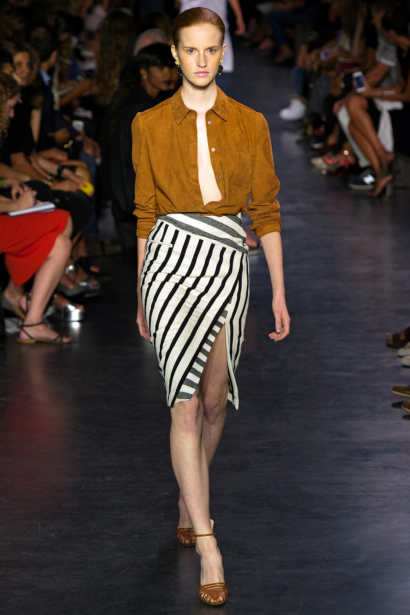
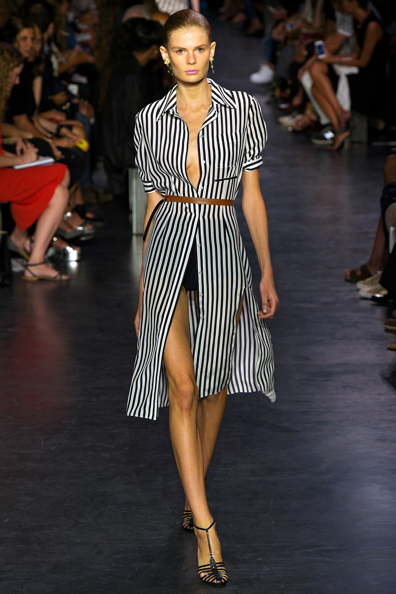
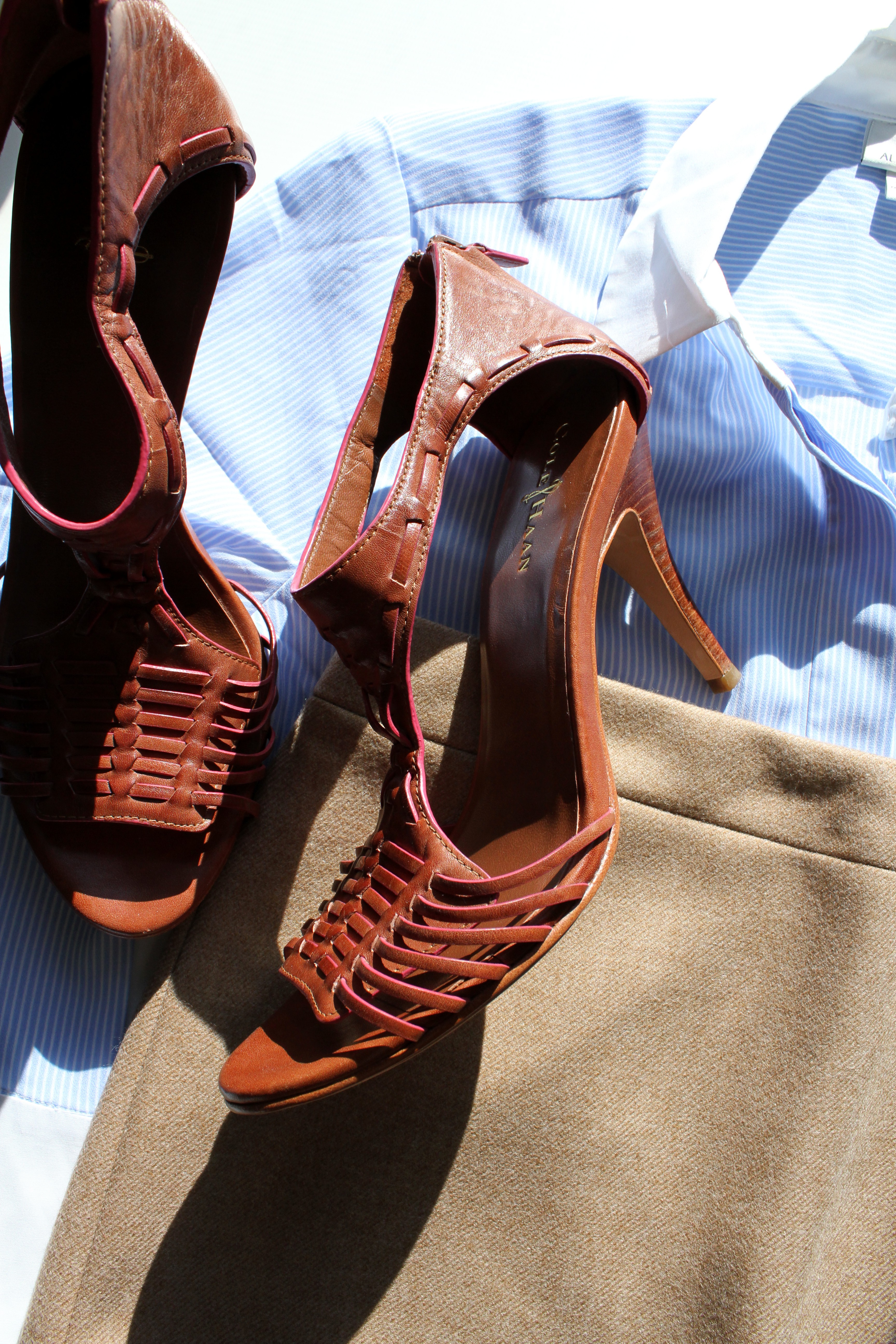
Then shoes, I think (though any element may be the starting place, and any may yield the next). And I still have those heeled huaraches from the Altuzarra show on my mind, so something along those lines, but in a richer shade now.
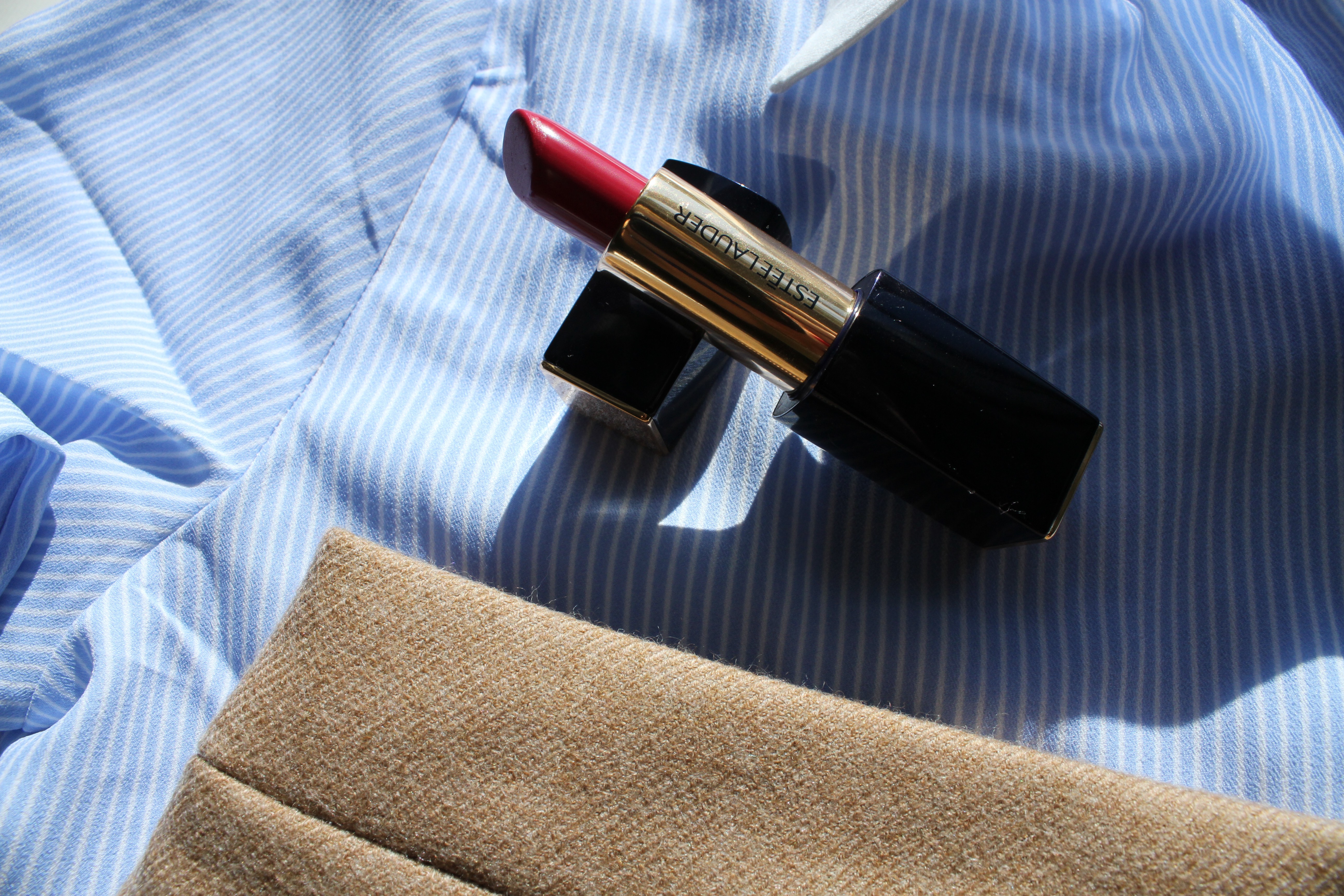
Then lipstick, surely. I could go in a few directions here, anything on the red or plum spectrums, even a rusty orange, but a medium to dark fuchsia wins the day. Cannot recommend the Estée Lauder Pure Color Envy line enough.
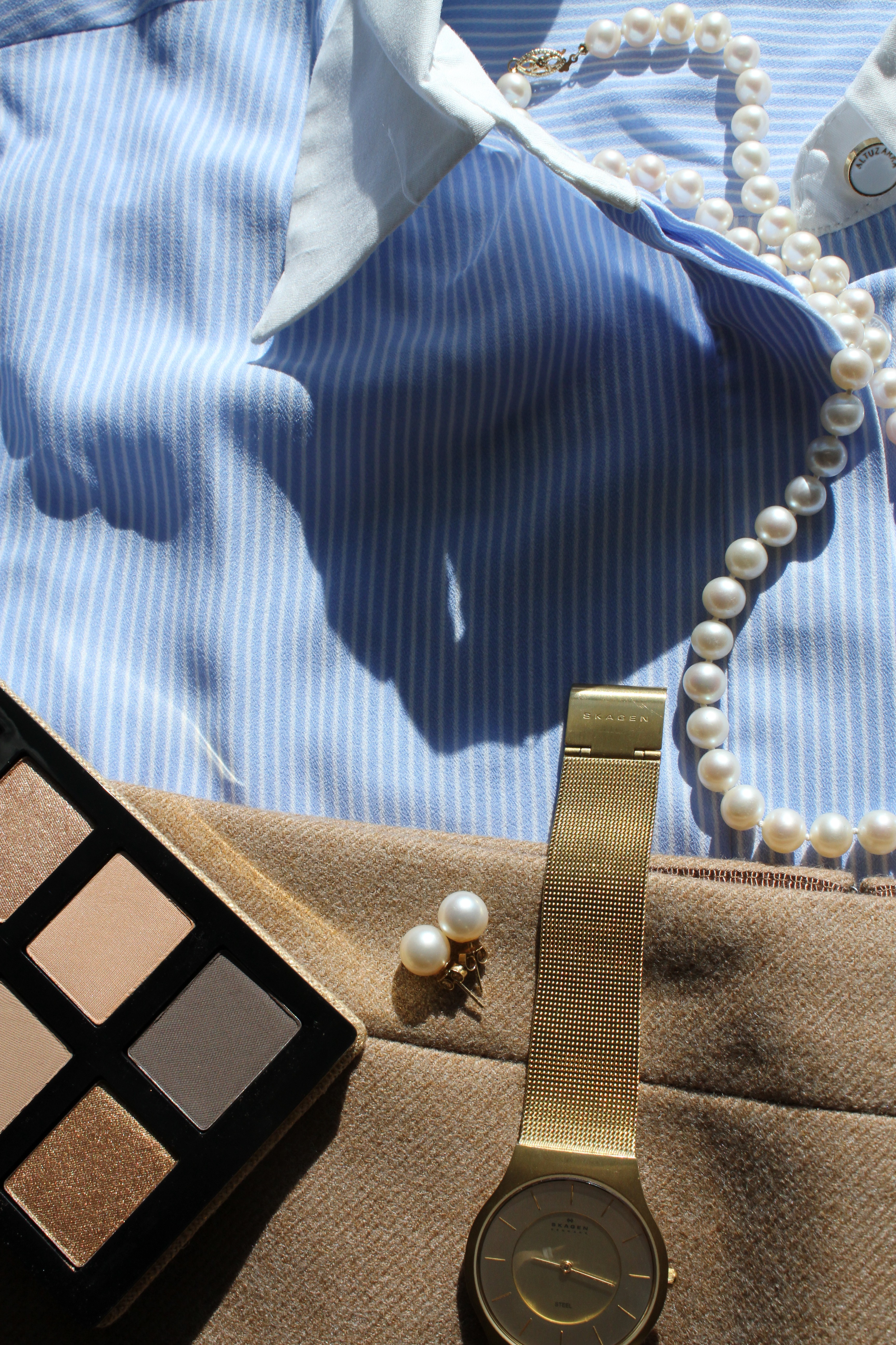
Then I see browns, golds, ivories for the other accents. Pearls, of course pearls. This is the Bobbi Brown Surf & Sand palette, an excellent option for a basic mix of easy shimmery and matte neutrals. I like this strong blue anchor (not that it is a bold blue, but that it is a definite, conspicuous piece of color), gently shadowed and warmed by pale neutrals. I know I’ve hit upon a a good color vein, or combination of color threads, when it pleases me to see them together. There is a certain almost visceral satisfaction to these happy combinations, as if sating your (ravenous, always) eyes with a nourishing meal.
It doesn’t matter what the colors are, really. Which categories they satisfy. Just as it is beneficial to begin thinking of makeup as one massive collection of pigments with various textures (not lipstick, but creamy pigment, not eyeshadow but powder pigment – so the potential applications begin to multiply), so you begin to think of your entire wardrobe (and more and more of life begins to fall into the category of wardrobe, of style) as a collection of colors in varying shapes and sizes, textures. Building blocks.
Then I toss in a watch. Gold-toned, surely. Love the sleek, clean designs of Danish brand Skagen’s watches.
Just one example.